McGraw-Hill Education
Online retail for education
Work was completed in 2015.
McGraw-Hill Education (MHE) publishes and sells textbooks for all educational levels. Their customer base is made up of school systems, universities, students, and their parents. Common in the publishing industry, MHE grew through acquisition of smaller textbook publishers focused on different grades. Also common in the publishing industry: none of these business lines were properly integrated into a single sales operation. MHE was facing serious organizational and operational challenges.
The team
Katarina Loughlin, UX Designer
Jason Bushey, Content Strategist
Randy Harbin, Creative Director
Michael Hardy, UX Designer
Suzanne Brendle, Content Strategist
What do we want to be?
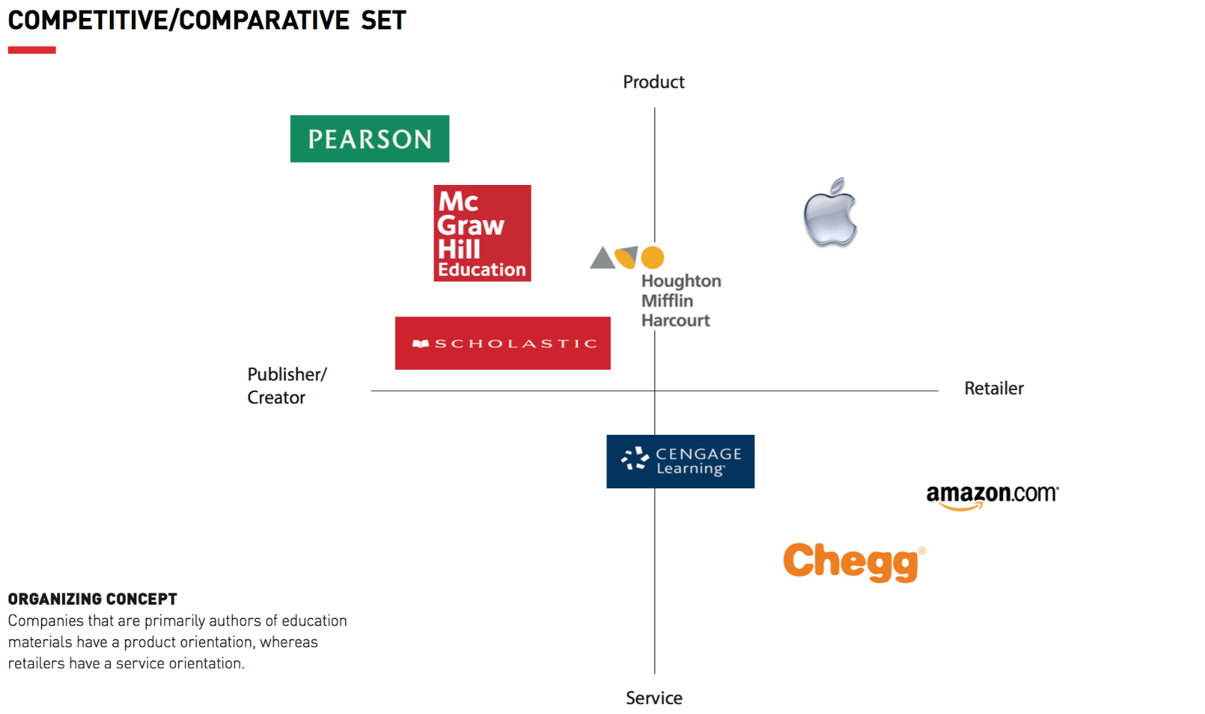
The education system is undergoing serious disruption due to emerging technologies and changing learning behaviors. As a textbook publisher, McGraw-Hill Education sees an opportunity to influence this transformation. We looked at the competitive landscape to see how MHE was positioned, as well as to understand what their competitors were doing.
credit: slide by Michael Hardy
McGraw-Hill Education also took a hard, honest look at what they were. Digitally MHE is a collection of many websites (over 500 unique websites). Their main business lines are PreK-12, Higher Education, Professional, International and CTB (testing services). Each conducted business in their own manner. We needed to determine a way for each to move forward in unison.
We brought the key business leads together for a deep-dive workshop. We identified core problems and opportunities. We began interviewing stakeholders and customers. We spoke with people from across the country (and even around the globe) to get their take on education. It was through this process that one of our biggest revelations was made.
Textbooks have become outdated. Content can be broken down into smaller and smaller digestible pieces that can be consumed as needed or desired. MHE decided to reinvent itself to serve this reality. They would provide on-demand educational content. We began building the infrastructure to support this inititive.
Work collaboratively
MHE wanted their designers to be part of the creative process so that our two companies would work collaboratively. More clients are asking agencies to work this way, though it presents challenges. Skillsets, personalities, experience all become factors to be managed. As the UX Lead, it was my responsibility to unite the team:
4 UX Designers (2 from Sapient, 2 from MHE)
4 Visual Designers (3 from Sapient, 1 from MHE)
1 Content Strategist (from Sapient)
In addition, my team had to work closely with teams of Business Analysts, Product Managers, and Front-end Developers. I established a war room for the project and had the whole team collocate there. I endeavored to make sure the MHE designers felt welcome and comfortable with the pace and process. We established a working rhythm where designers were assigned specific feature sets. Each designer was responsible from conception through build. The team collectively reviewed all work regularly to ensure a cohesiveness to the site.
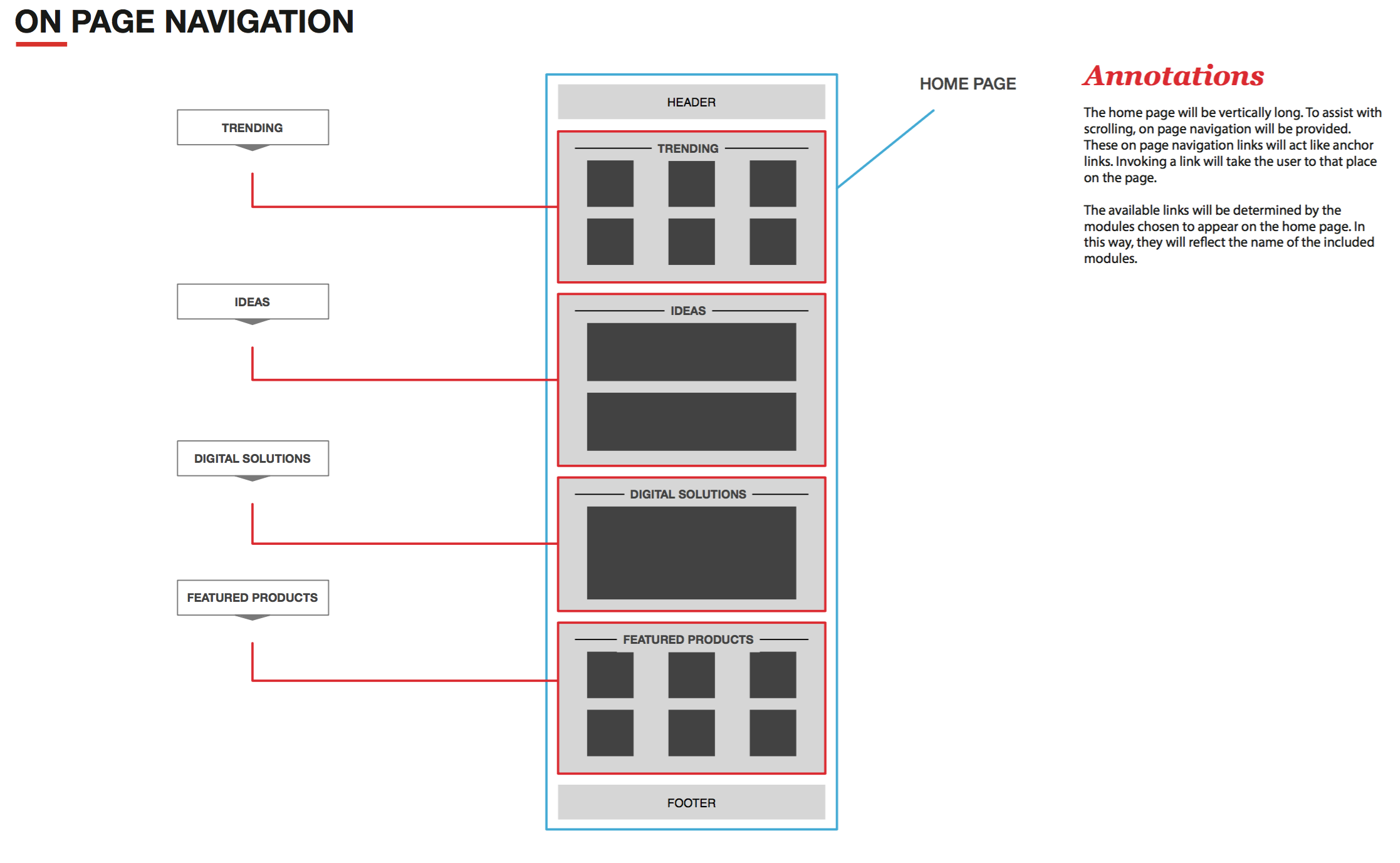
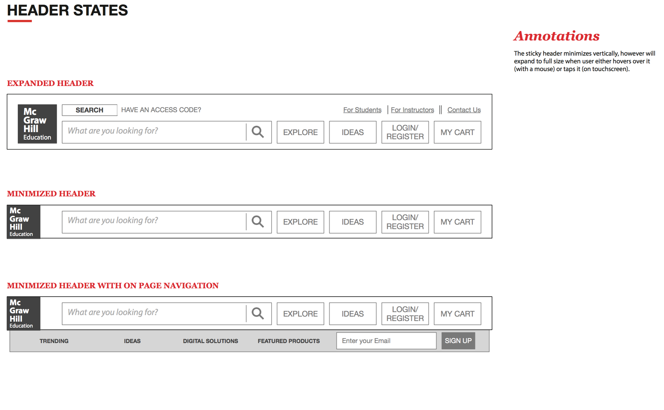
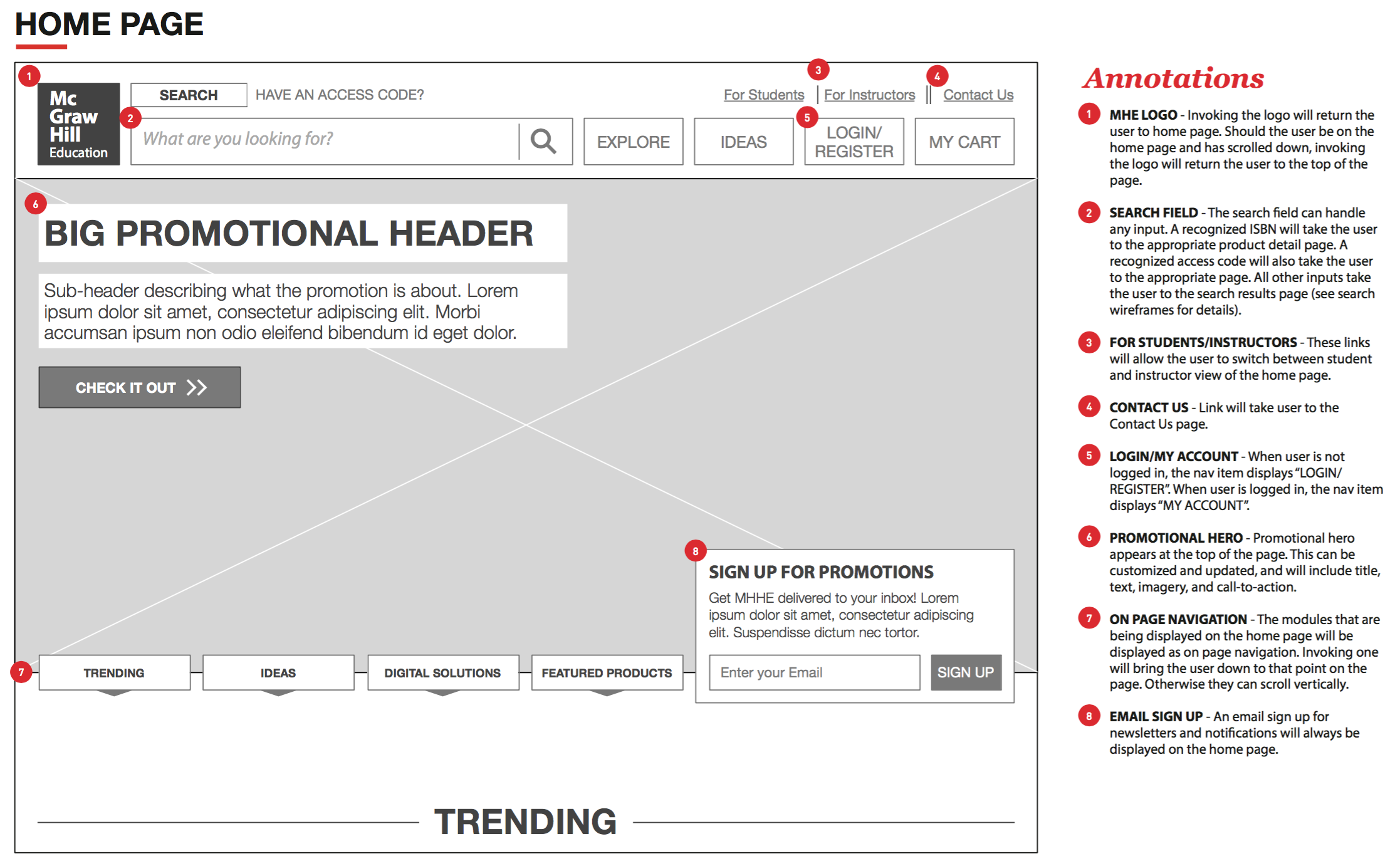
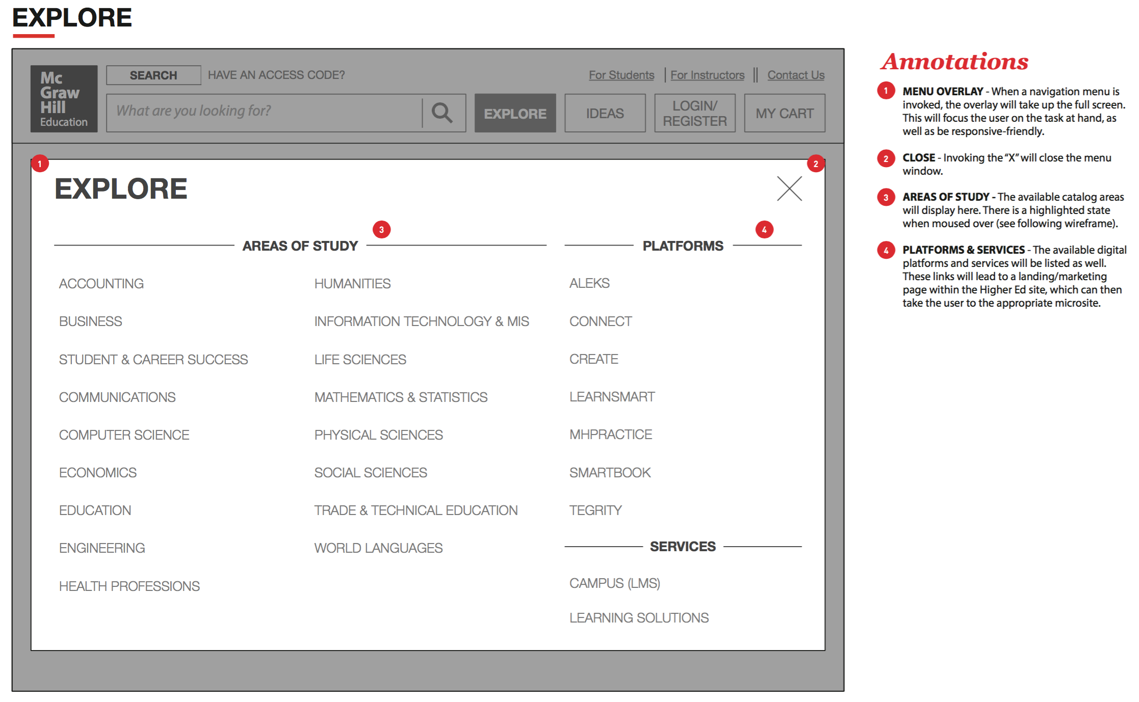
A PERSONALIZED EXPERIENCE
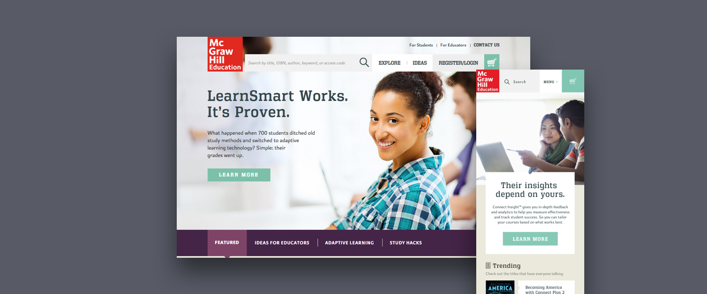
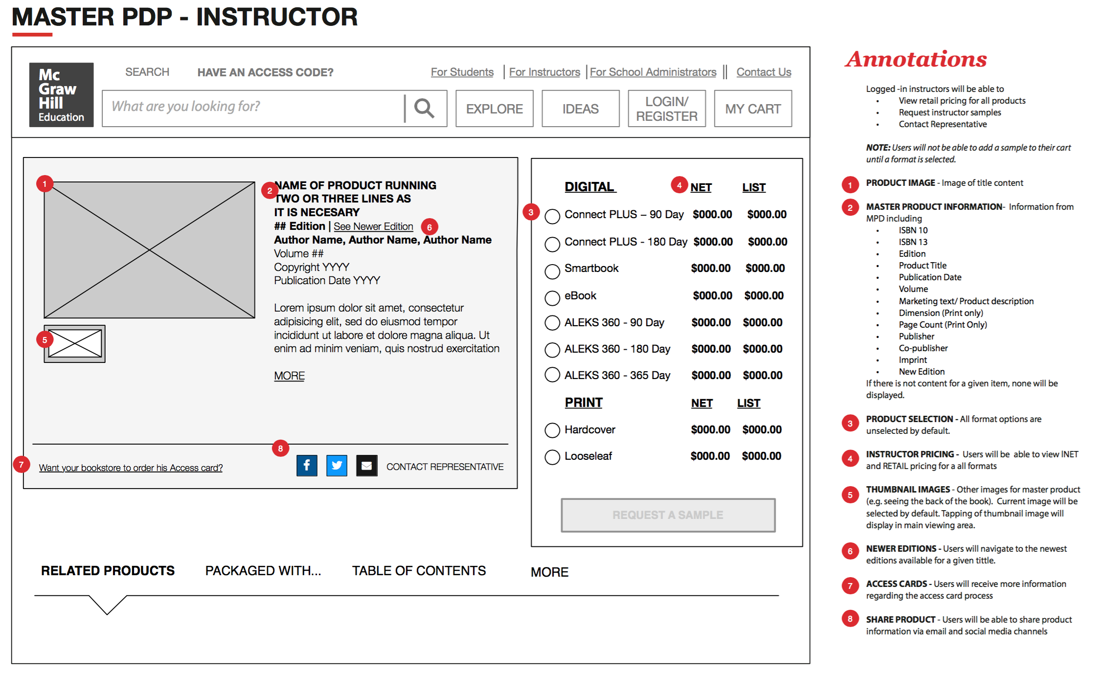
Release 1 focused on migrating the Higher Education business line onto our new ecommerce platform. This meant combining two separate shopping experiences (and websites) into one. Higher Education had a site for college students to buy textbooks assigned to them, and a different site for college professors to review and sample various materials (professors can order free samples; they actually do not purchase anything from MHE). We would need to provide a relevant experience to each of these unique segments on the same platform.
The site pivots based on personalization. Login is not required to browse, though notification is provided on product detail pages that allow users to switch the experience when looking for restricted content. Logged in users - professors and students - see only the experience personalized for them.
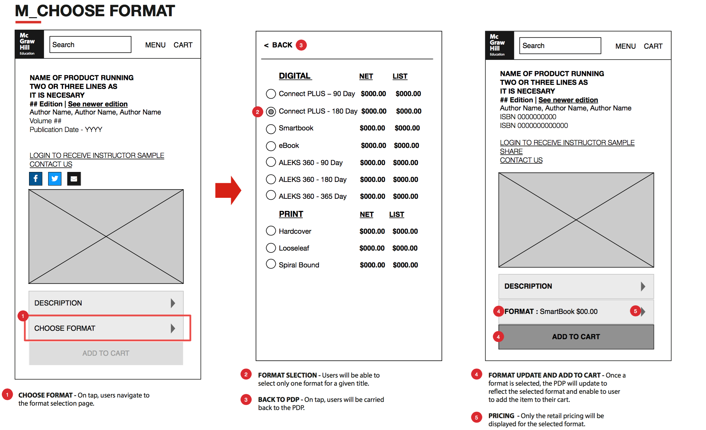
Mobile Friendly
One insight we had from our research and concept phase is that students are shifting more and more towards mobile browsing (yes, we can say that about most any site design these days). McGraw-Hill Education did not have a single mobile-friendly site, responsive or otherwise. We realized to service our intended audience the site needed to be fully responsive.
We worked closely with the front-end dev team to ensure our designs worked responsively. We would bring them into design sessions and bounce sketches and other ideas off them regularly. Communication was crucial. To demonstrate our intent for the proposed sticky header I built a prototype.
A Successful Launch
The new McGraw-Hill Education site launched successfully in November of 2014. Sales reps immediately started directing customers to the new site. MHE Marketing ran a number of successful outreach campaigns that had a huge impact on traffic. We've already begun the hard work of bringing additional MHE business lines onto the new site.
