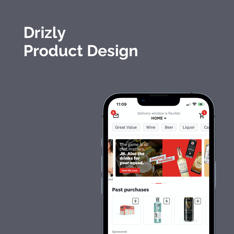
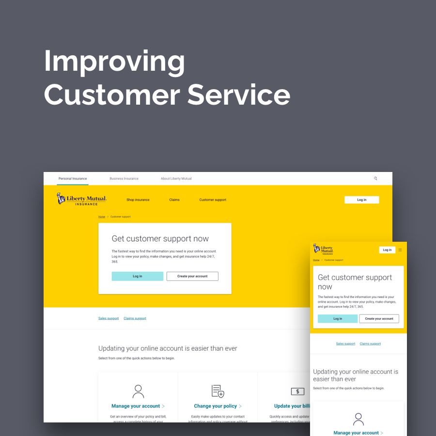
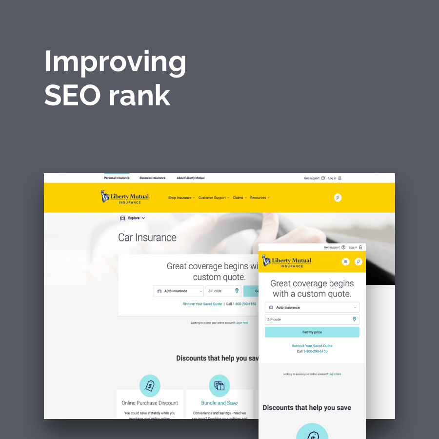
Liberty Mutual RightTrack
Mobile app with in-car integration
Work was completed in 2016, while working at SapientNitro.
RightTrack is Liberty Mutual’s safe driving program. Drivers install a transponder in their car that records driving behavior. Safer drivers receive discounts on their car insurance. Drivers can track their status via a mobile app.
The team
Thibault Kim, Designer
Forrest Frazier, Developer
Stephanie Ciccolini, UX Designer
Akshay Sarma, UX Designer
Derek Wakeen, Designer
The challenge
The RightTrack program consisted of three separate programs representing different geographical locations. The challenge before us was to create a single, user experience that supported Liberty Mutual customers and actually helped changed behavior - make them better drivers.
What was different about this project - compared to other SapientNitro work - is that we would be working in scrum. 1 week sprints where we were only on the hook to demo working code. None of the extraneous presentation and bloated deliverables that Agencies typically produce and clients expect to approve.
I served as creative director in charge of the design team - two UX designers and a visual designer. Before kick-off, I sat my team down and explained that we were not on the hook for any deliverables. What this meant is we only needed to go to the level of fidelity that was required by the dev team. If this meant whiteboard sketches, that’s what we would create. If we needed more formal annotated wireframes, well we’d create that as needed. What was most important is providing our team with exactly what they need.
Over the course of the project, we never created a wireframe more formal than a whiteboard sketch.

UX at the whiteboard working

Our wireframes
culture before process
Our entire team was situated in a dedicated war room. UX, design, BA, QA, Dev - all in a single space. Many of the people in the room had never worked with one or more of the other disciplines previously. It was a new arrangement for everyone.

Our war room (I'm sitting at the desk on the left)
What was most crucial in these first weeks of the project was building team culture. Learning to communicate and trust each other came before truly understanding the scrum process. This was a change from previous agile attempts at Sapient. There had been (many) other attempts at working agile with clients. They typically resulted in waterfall with shorter timelines. I remember one project where the client’s BA wrote a JIRA story: “As a UX designer, I want to create wireframes for the PO to approve.”
What I appreciate now - comparing past Agile engagements with the Liberty Mutual project - is that there was too much focus on process first. It won’t work that way. Building up trust in one’s team members is crucial. Truly forming a team that relies on each other and works together must take place. As creative director and project lead, focusing on supporting and nurturing culture was my biggest responsibility. And it paid off.

If it takes more than 15 minutes of discussion…
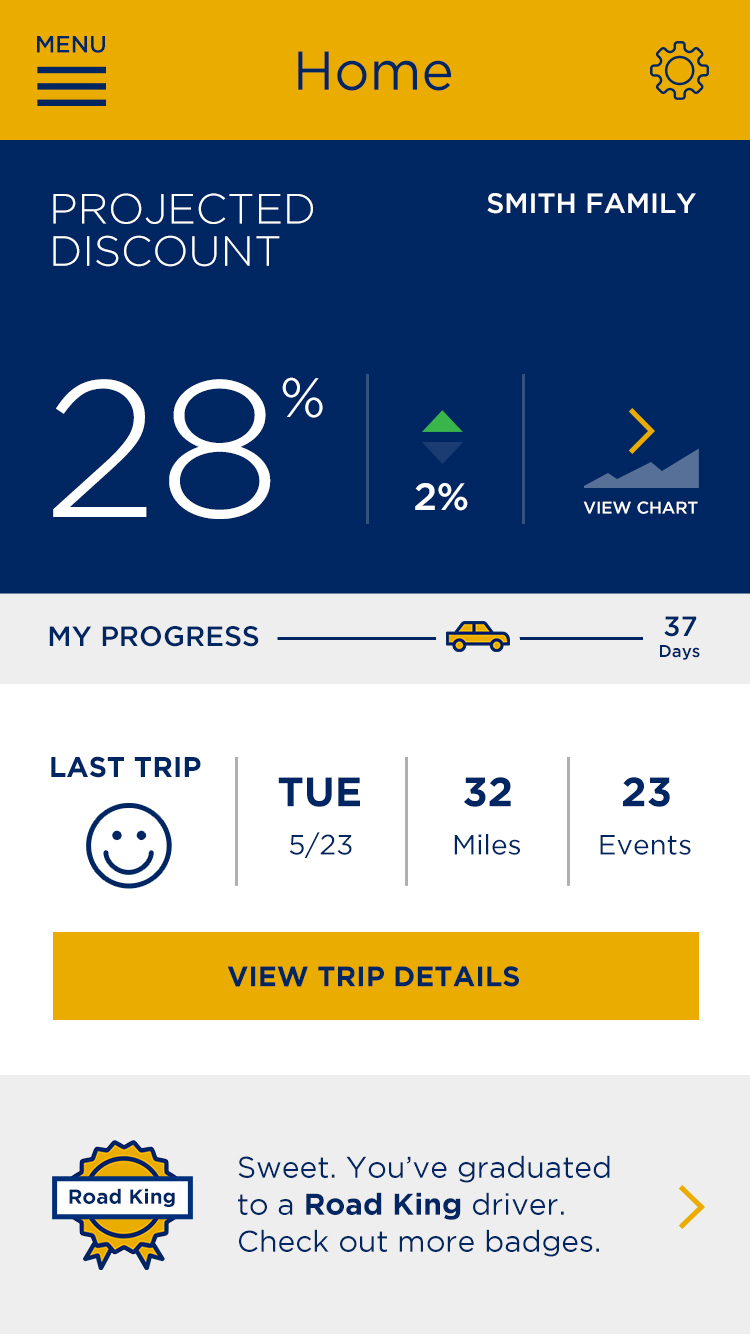
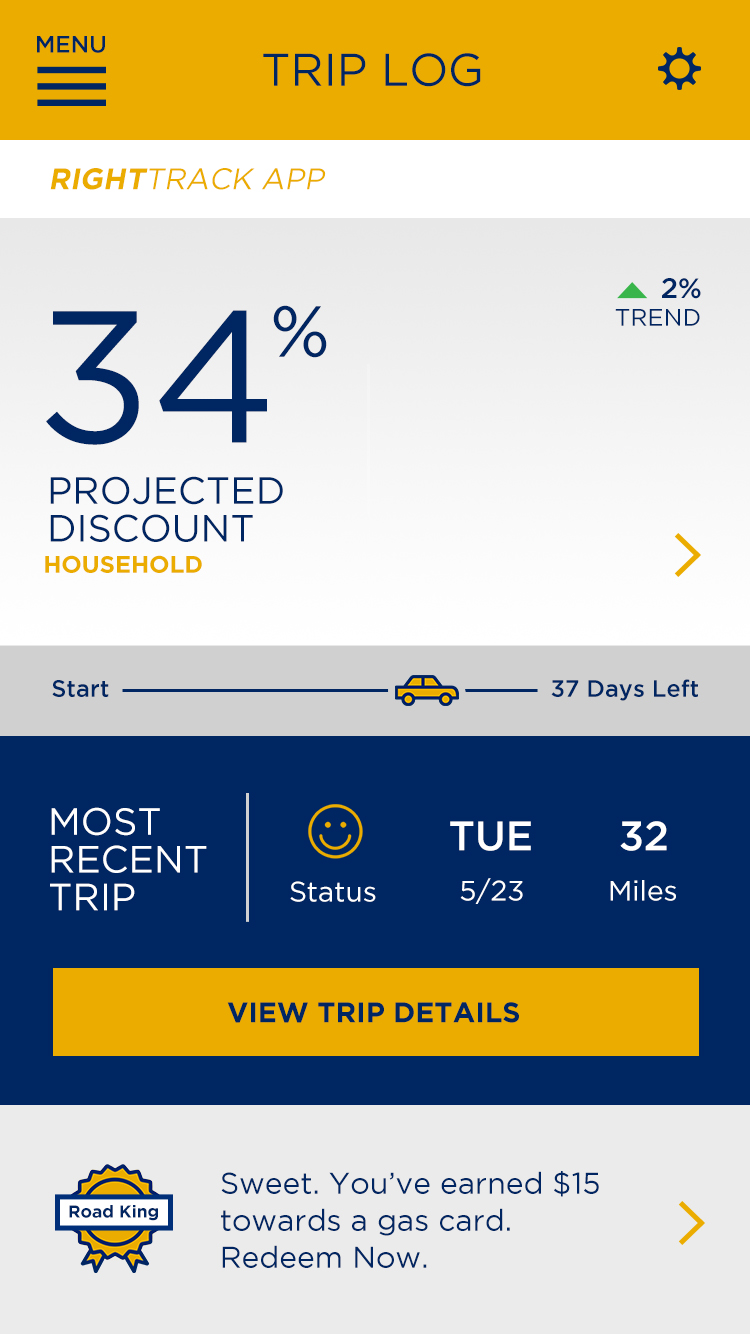
Early on in the project my design team came to me with a problem they couldn’t solve. It involved an interactive graph that depicted the different drivers within a family and how each impacted their plan’s discount - either positively or negatively.

Early concept of interactive graph
The team couldn’t agree on how it should function. They disagreed on what was important to show and what users would expect. They wanted me to choose a direction.
Each side made their case. Then they began to debate the points they had already made. So I told them to test it. We quickly dropped the screens (these were visual design comps) into a simple prototype, loaded them onto a phone, and guerrilla tested it in the office.
We recruited 6 people to run through the screens and explain what they expected and what they wanted to see. The results were definitive. No one wanted an interactive graph.
What we learned is that people were more interested in understanding what the different data points were that calculated a driver’s score. We eliminated the interactive graph - which would have been challenging to build and certainly time-consuming - and replaced it with a single informational page.

The legend explains the key metrics
After that I instituted a rule: “If it takes more than 15 minutes of discussion, test it.” Over the course of the project we conducted a number of such lightweight user tests. We averaged about one test every 1.5 weeks. This greatly improved our design of the product and helped guide our work. We were sure to share with the whole team the results of each test. Everyone stayed aligned.
Leveraging Atomic Design
Early on we made a commitment to use Atomic Design as part of our process. It was actually pushed for by the dev team. There was concern from the design team that this was limiting, and didn’t respect their process. I heard from the office’s creative leadership - those i report to and were not part of our scrum team - that this approach could possibly curtail quality design for the sake of dev expediency. I confess that at the time, I had my own reservations.
I’m glad we employed Atomic Design. Its simplest benefit is that it helped build communication and trust between design and dev (see culture above). We got to a place where tweaking and improving elements - even more than once - was no problem as we just redefined the asset and handed it off to dev. Dev welcomed and incorporated any change we wanted to make. This is something that would have been unheard of on any previous project. As a result, our dashboard was constantly being updated as we worked on the app.
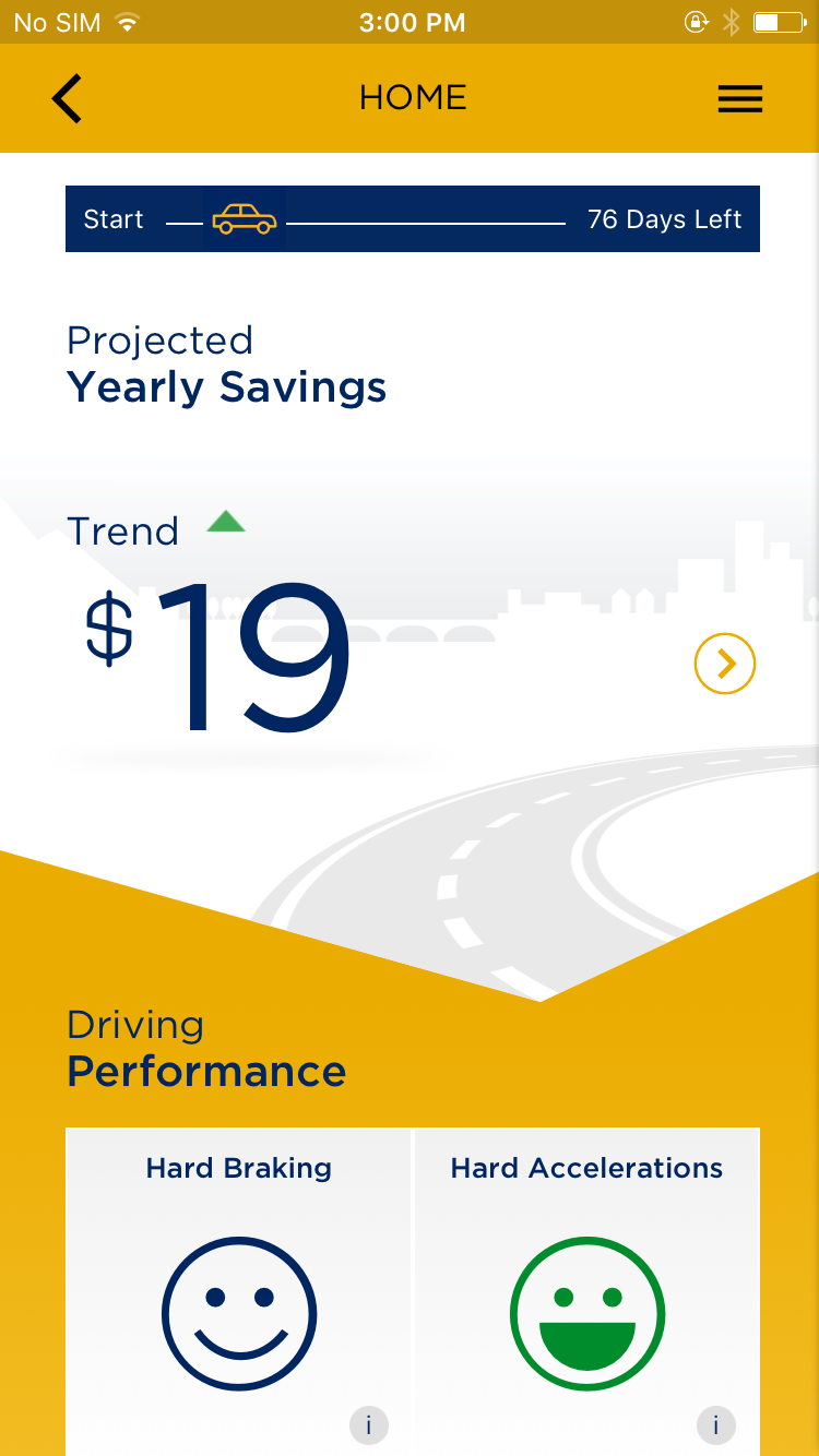
Evolution of the dashboard over 6 weeks
There was a question about polish with our designs. Some of our initial screens looked basic or lacked some of the higher-quality designs one might expect from our team. “It just doesn’t pop,” said one client sponsor early on. What we learned is that as the design system gets built out, as we refine and better understand what we’re building, we can add more detail. Our designs - the app - got to a great place. It was ok that we started out “slow.” With dev on board with updating elements as we refined them, the polish appeared. Trust in the process.
The Scrum roadshow
Truly working in Scrum was a revelation for SapientNitro. Many teams had tried, and to varying degrees it worked partly. Word of our progress had spread. I became the point person for advocating and explaining our approach.
I presented to our Boston office several times. I also presented to Sapient’s global tech leadership, and global experience design leadership.

My first presentation to the office
my second presentation to the office
The biggest question I got was how do you do design in an agile process. This was my response:
“Explaining how design fits into scrum is a little like trying to explain why a joke is funny.”
UX worked with a BA and the Product Owner to work through the features that we had in our backlog. All of this was done via whiteboard sketches. Once agreement was reached, the BA and UX designers would write JIRA tickets. Then the whiteboard sketches were updated with corresponding JIRA numbers. A picture of the annotated sketch was added to the ticket.
Our Definition of Ready included a whiteboard sketch. Design needed to create new elements, though this support also happened within the sprint. Our Definition of Done included sign off by UX and Visual Design before getting PO approval (this was a lesson learned the hard way).
It all comes back to team culture and specifically trust. Devs could ask for ongoing support within the sprint. Design could request an update to a finished screen because the new design was better. Everyone worked together.

LEFT: Design building a prototype for testing | CENTER: UX, Dev, QA discussing login | RIGHT: UX, BA, SM writing stories
Conclusion
The new RightTrack app launched in the app store last March. You have to be a Liberty Mutual customer to use the app. This was by far the funnest and most effective project I've worked on. On a personal note, this was one of the best projects I've worked on in my career. I loved my Scrum team and how we came together to work in a new way and to overwhelmingly impress the client. And they were impressed. What started as a 10 week engagement has extended into an ongoing partnership.
view more of my work