Dropcast
Augmented reality social media app
Work was completed in 2014.
Dropcast is a geo-location social media app where the user is able to place multimedia content anywhere in the real world to be discovered by others. This was an internal product development effort at SapientNitro. I was the UX lead for the project and worked on it for over a year.
Dropcast was a response to an internal discussion at Sapient: “What does the future of marketing look like?” (yes that line is a little full of itself, but please stay with me). This is how the project was sold internally at the company. What those of us working on it – passionately – wanted to do was develop a new platform for people to share and consume content in unusual and unlikely places. Where people today jump on Facebook to see what others are doing elsewhere, we wanted people to discover what had happened (or is happening) where they are.
Let me be up front about Dropcast: the product failed. There are a lot of reasons for this. I - along with my team - bear responsibility for that. While we didn’t revolutionize the world with our new app, I learned a lot from my time working on Dropcast and it greatly impacted the way I think about design and building digital experiences. No one uses Dropcast today. But I’m better for having worked on it.
Design, Iterate, Repeat
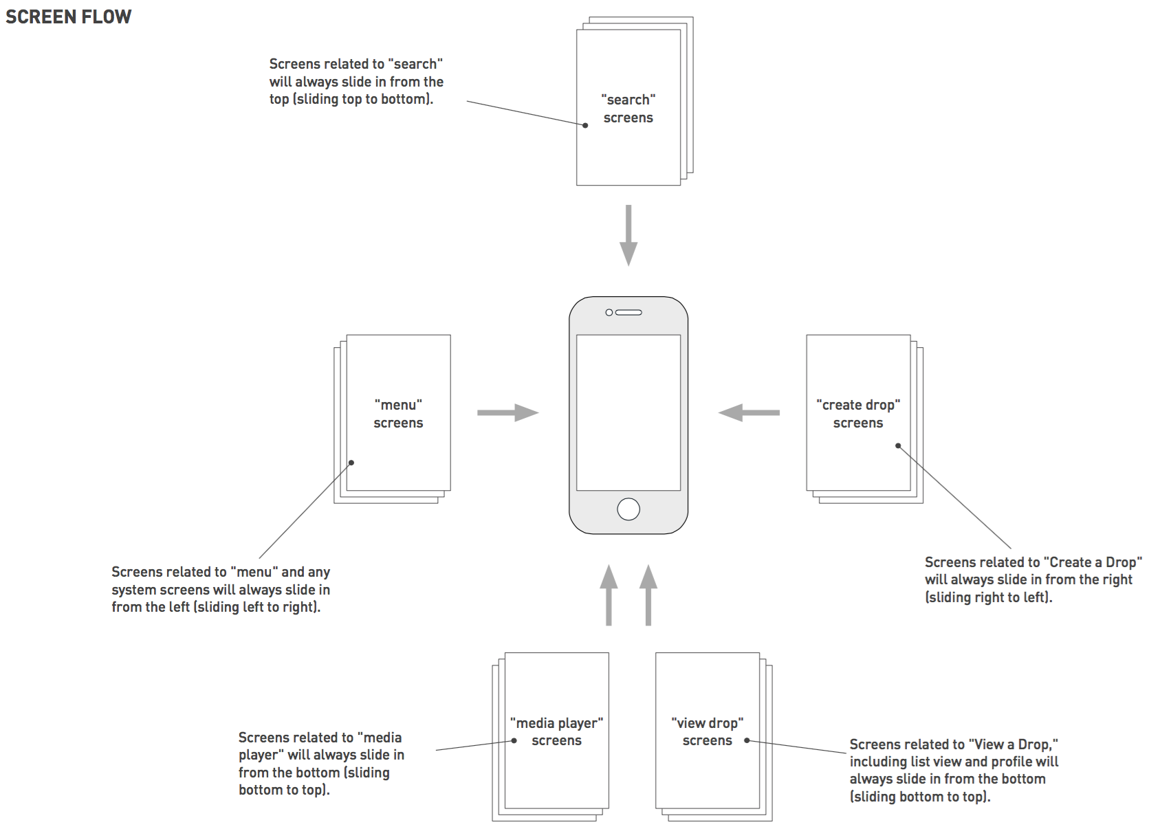
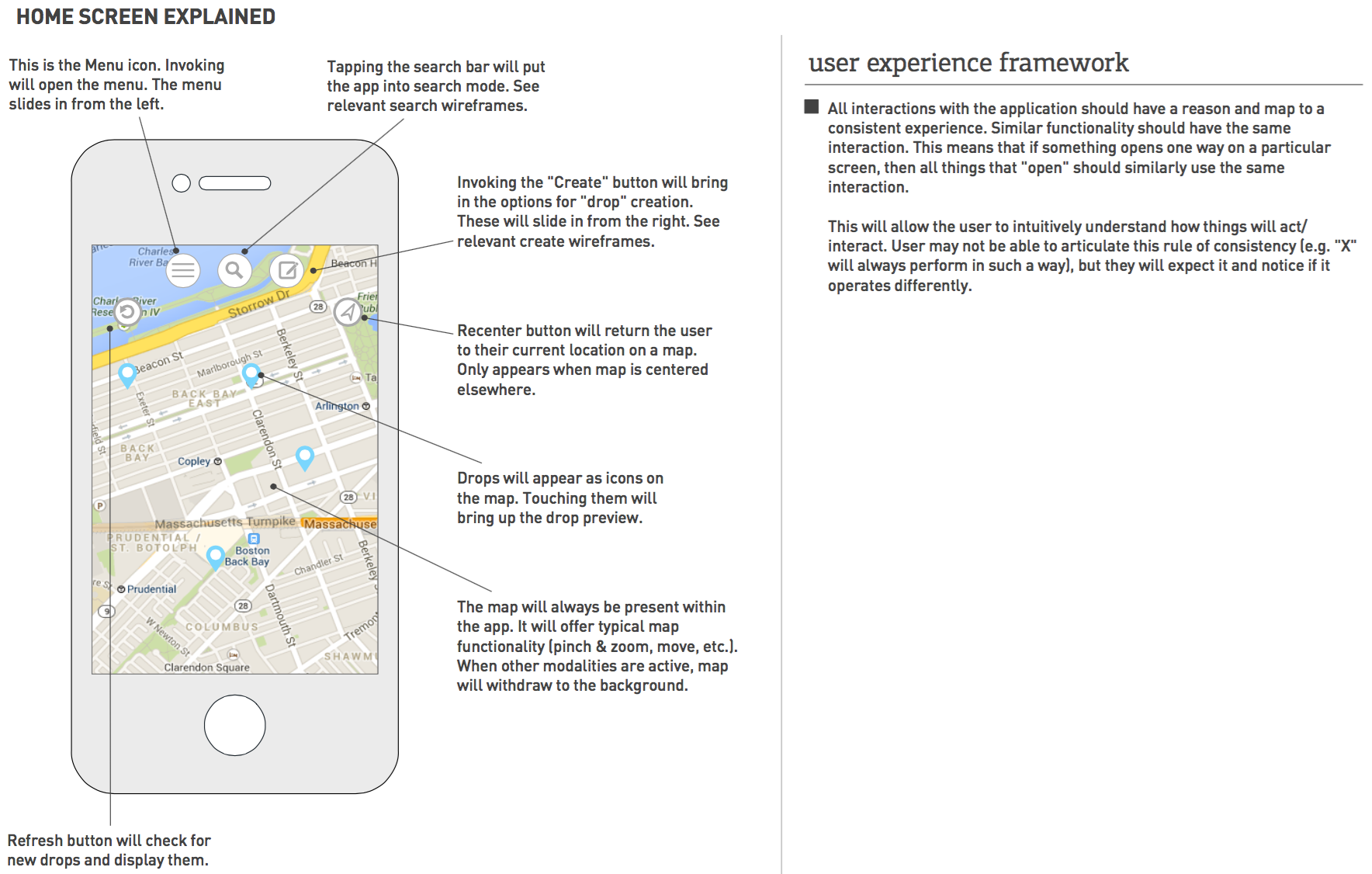
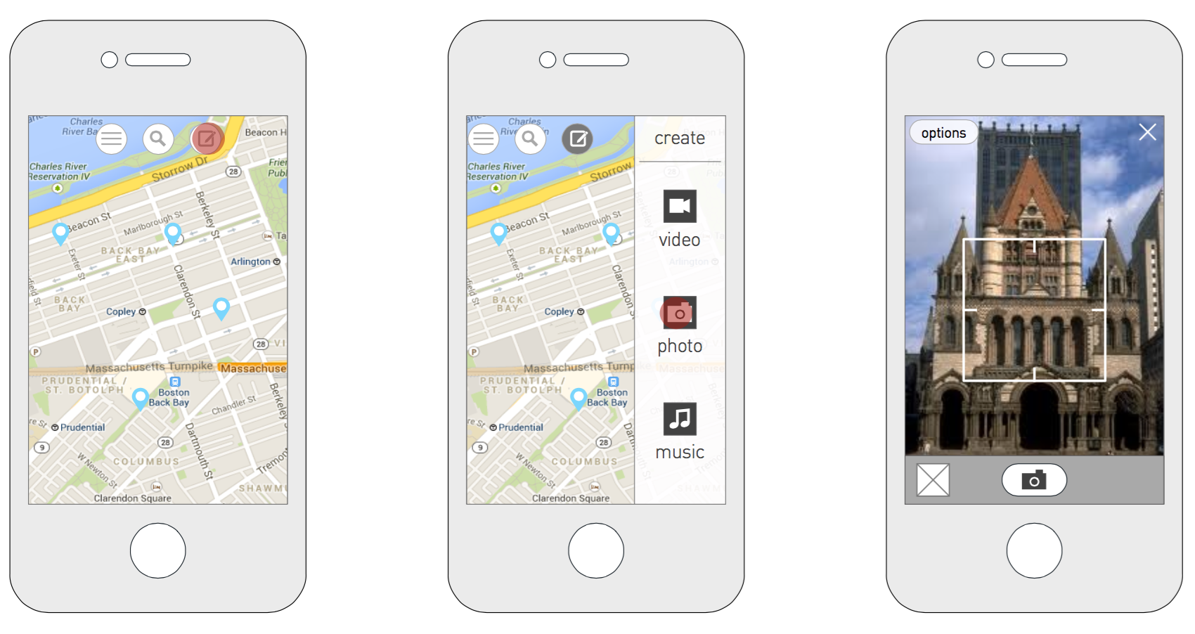
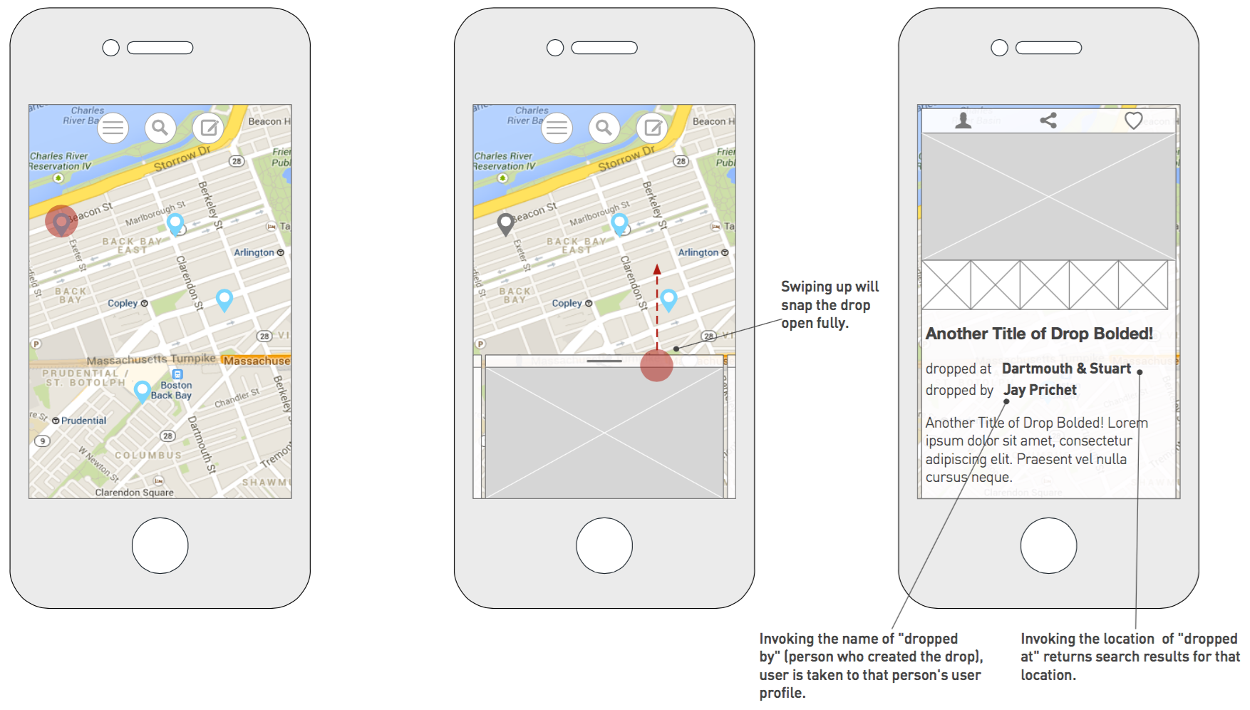
Brought on to handle the UX and help define the features and shape the app, I began early with lots of hand sketches. We reviewed these daily with the product manager, tech lead, and "CEO." Early on the challenge was moving us from what we felt was a strong, somewhat amorphous idea to a workable and very realy product. A lot of sketches and wireframes were created during this stage to help get to our version 1 feature set.
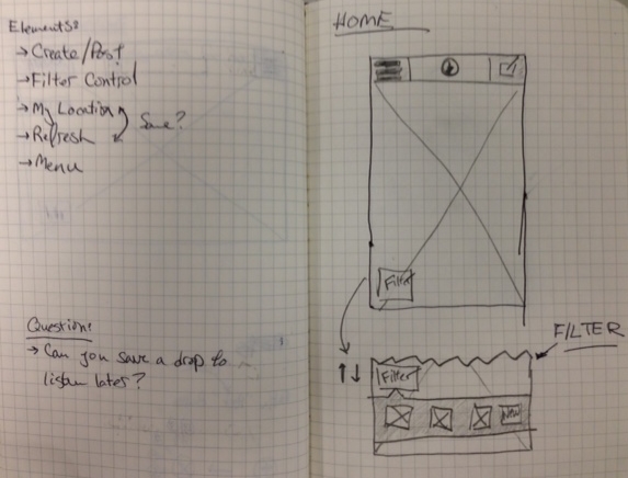
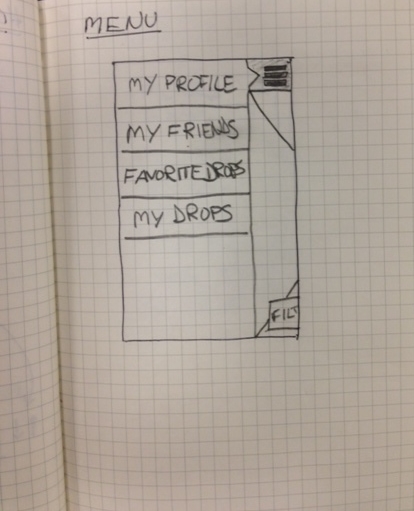
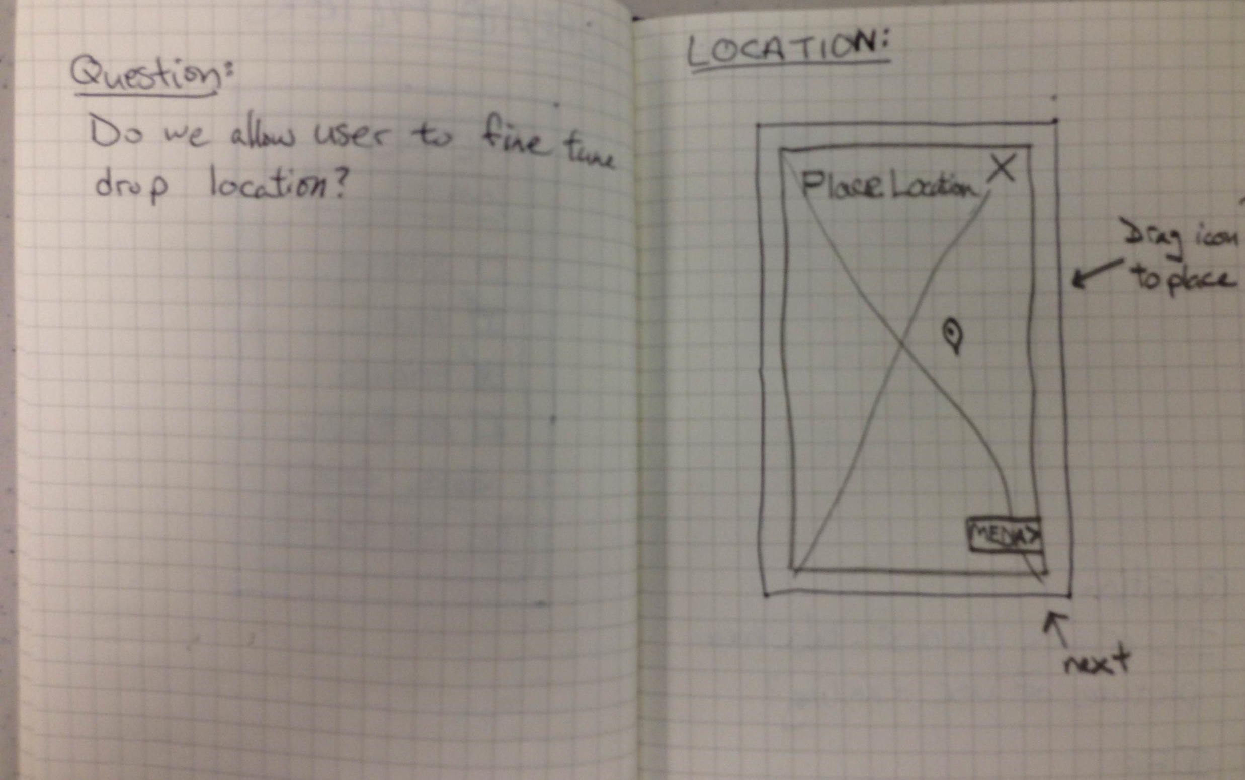
While this creative (and feature set) exploration is critical to any new design, I appreciate now that we had no process in place to truly figure out what users wanted. We were going by our own instincts. Were I back at that time again, I would have started validating features with users; I would have focused on building small prototypes to test our assumptions.
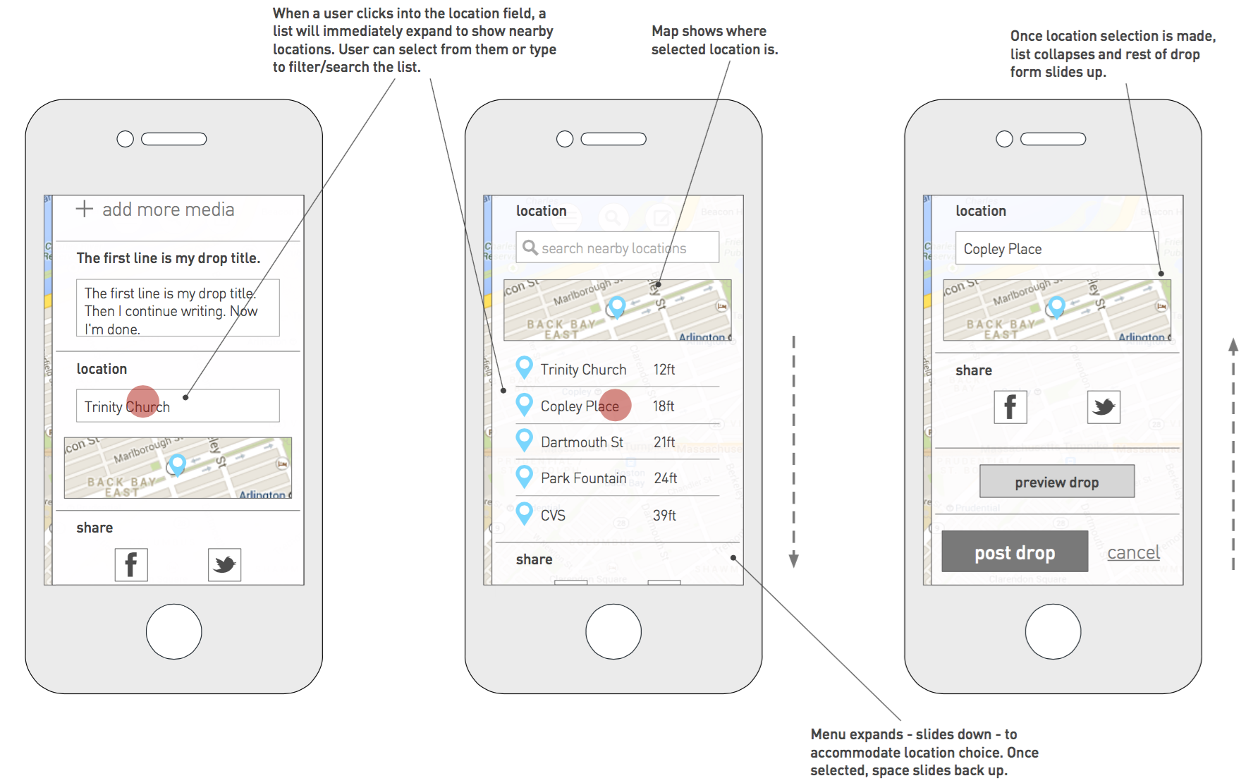
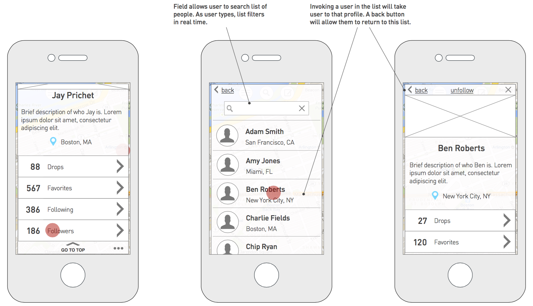
Build, Then Fix
The design phase was long and at times cyclical. We delayed build because we felt we needed to have the design right (this assertion I've since learned is wrong). Once we eventually began building the app we started to get smarter.
As the build progressed and we had working pieces of the app, I would meet multiple times per day with the Product Manager, lead developer, and project manager to review progress and make iterative design decisions. These decisions were finally based on relevant data points (we had a thing to play with when previously it was all just wireframes and visual designs). We could see what was working and what wasn’t. My biggest takeaway from this project is that we needed to get to this phase faster. To have something built (no matter how incomplete) that could be interacted with and experienced.
User Testing
Once we had an alpha version, we recruited a number of testers to try it out over several weeks. The feedback helped us identify bugs as well as enhancements that could improve Dropcast. I wrote weekly surveys that we sent to these testers to help us better understand what users were thinking, as well as explore certain areas we needed more clarity around. This feedback helped shift our feature prioritization as well as the overall design of the app.
PRODUCT LAUNCH (HOORAY!)
Dropcast launched at SXSW. This was a great moment for the team and a feeling that's hard to describe.
We launched Dropcast at SXSW
And now back to work
As we turned our attention to version 2 (fix the things we couldn’t in version 1, add the features we couldn’t get done by launch), I was thinking more about process. Around this time I came across this post by Matt Schlicht which helped change my thinking about product design (as opposed to “agency” design which had been our approach). I read a lot on the subject and shared these articles with my team. One thing I was committed to was integrating prototypes earlier in the process. To that end, I began teaching myself Origami and built several mock-ups with that.
New Create Interaction
I built this prototype to explore a new way to initiate the "Create" flow. We were attempting to streamline the flow as well as prioritize creating new content.
NEW Menu INTERACTION
I built this prototype to explore a simpler navigation. it reduces the number of main nav items from 3 to 2.
Note: we also incorporated a new visual design style for the app.
The use of prototypes was extremely helpful to the team and informed our decisions. This, coupled along with the metrics we were getting from actual users helped us make smarter decisions.
And that's a wrap
While we did end up pushing an update several months later, the project was wound down as we did not build traction. I consider building Dropcast a great experience and I learned a lot about product development and how to think about process differently. I’ve taken those principles and begun applying them to the core work we do at Sapient. I’m currently developing a new practice within Sapient that is based on product management principles and utilizes creative design sprints (testing with users weekly as you build).
I wrote about some of this experience on Medium. You can read my post here.


