Drizly Product Design
UX Informs Product decisions
When I joined Drizly at the beginning of 2021, the company was at a bit of a cross-roads from a product perspective. Uber had just announced plans to acquire the company for $1.1 billion. Covid had driven rapid growth for the alcohol delivery service as people were stuck at home. Little product innovation was done as the small, scrappy team was focused on meeting the huge demand. With Covid receding and people beginning to leave the house, demand slowed.
How would Drizly improve the experience to capture its users? There was a long list of features to tackle, enhancements to make, but what were the right ones to go after first?
An investment in Design
At that time the product design team consisted of 3 designers, recently moved over from the marketing org to report directly to the Head of Product. These designers were asked to support engineering efforts across multiple business focuses (consumer, retailer, supplier ads, corporate). There was no design leadership. As a result things were addressed adhoc and design priority fell to personal relationships - this PM new the designer and came to him with tasks while another PM less familiar made due with little interaction with but for the most pressing needs.
I was brought in to build a more mature design team. I met with all parts of the product and engineering orgs as well as the larger Drizly company to understand how the teams worked, what was missing, and how to more effectively integrate design. I developed a vision for design at Drizly, how we would operate and support the company, and shared that vision with leadership and the whole organization. I showed how design can elevate Drizly.

Slides from Drizly Design Vision deck
What was most important to me at this time was establishing a design process that would more often lead consistently to positive outcomes. This would replace the one-offs and short term, reactionary habits that had developed. With the team’s help we established design principles to guide our work.

Drizly design principles
I also aligned our team to focus on the core business areas of Drizly: Consumer, Retailer, Supplier Ad Revenue. As we hired and grew the team, we were able to dedicate more focus to underserved business lines and produce consistent growth. An early win here was establishing the first dedicated team focused on Supplier ads.

Video supplier ads was a UX-led initiative that launched in early 2023.
And with more dedicated focus from designers, each was able to more comprehensively support a squad and their mission. We began running design thinking exercises with PMs and engineers to tackle their respective challenges. This led to more thoughtful and targeted experiments and solutions to improve the experience.
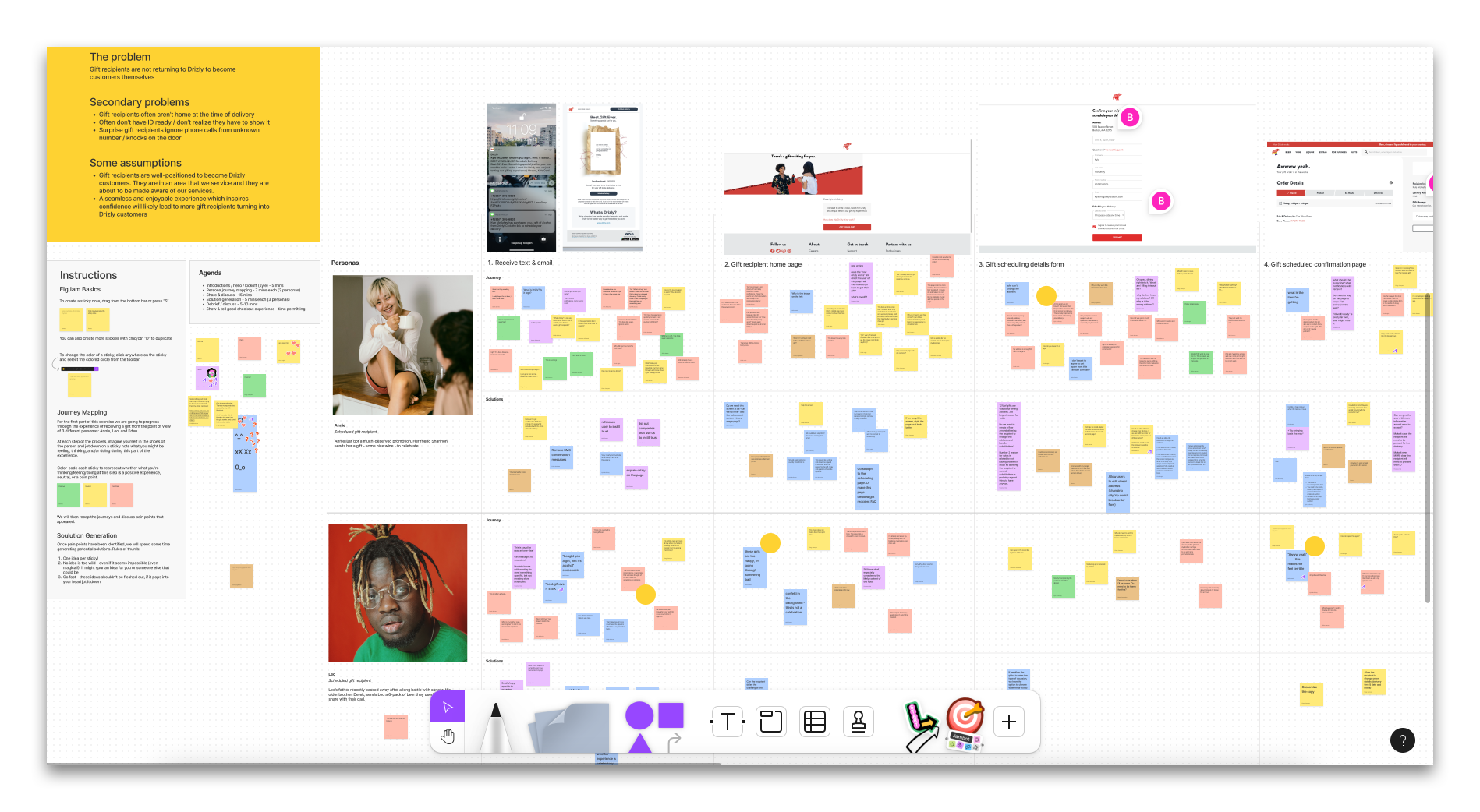
Design-led brainstorm on how to improve the gifting experience
Establishing User Research
That year I hired my first user researcher and together we built a strong research program to assist across the org in understanding user behavior and helping inform product decisions. This was not a discipline that had previously existed at Drizly; squads were used to working without research and so didn’t see a pressing need to incorporate it. We put a lot of effort into education and promotion about research and it’s potential impact. We worked with PMs across the company to identify opportunities to help, while demonstrating that research could be instructive without slowing down a team.
Research helped in choosing which features to build, and which to ignore. In-store pick up (ISP) was a hotly debated feature request within Drizly. It would allow users to purchase through the app and pick up in the store; no delivery. It would be a challenging feature to launch - a lot of coordination with the many retailers to properly set up the in-store experience (and maintain a level quality across the network), and a lot of work to build the logic into an already complicated purchase flow. We also had no insight into how desirable this feature was beyond our own intuition that “people want this!”
Employing the Kano model of analysis, user research was able to answer this question. We conducted a study to gauge user sentiment around several last-mile features. ISP was commonly met with indifference (not desired). This helped to inform an important product decision. We did not move forward with ISP. It also helped us move forward on a different feature.
Live order tracking
The original concept for Drizly was alcohol delivered in 60 minutes. Fast delivery is core to the experience. However user research showed that the draw of this was becoming less powerful. People were more motivated by the delivery arriving at an expected time than the expediency of that delivery. And our Kano model showed that transparency around delivery - live order tracking - was a feature that had moved into what would be considered table-stakes, or an expected feature. Live order tracking wasn’t something Drizly offered; because stores are responsible for delivery it is hard for us to track and provide real-time updates. Despite the logistical and technical challenges, research showed it was worth pursuing. We successfully launched live order tracking in 2023.
Live order tracking, 2023
A better eCommerce experience
The checkout flow on Drizly had been a significant point of friction for users. It spanned numerous screens and we noticed users dropping out of the flow. It also worked well enough, and there was other areas of the experience teams were focused on. Design pushed to greatly simplify the flow, reducing the number of screens to one (ideally). My team conducted several user tests to define the problem. We worked with Data Analytics to get clearer on the true pain points, and to gauge the size of the opportunity. We were able to prove out the worthiness of this work. A revamped single-page checkout was launched in 2022.
The improved checkout flow has led to an annual increase in sales of $5.8 million.
Checkout, 2021 | the old flow had 4 screens the user needed to click through before completing the order.

Checkout, 2023


Get users to the PDP faster
We recognized that the faster a user arrives at a PDP, the more likely that user will purchase. So the design team looked for ways to get users to improve this metric.
Dead-end search
One glaring opportunity was in search. Our dead-end search was exactly that. When a search result had zero matches, they were given no help in moving forward. The only thing that was offered up was a shelf of the most popular products on Drizly, unrelated to the attempted search. The user had to try a new search or back out. 20% of all searches on Drizly resulted in a dead-end. Design believed we could provide a better experience.
Working with Product and Data Analytics, we looked at most common null results searches as well as popular and trending searches. We designed several concepts and tested them. Most importantly we started human-tagging results with more relevant items. We went live in 2022 with a new dead-end search experience. Against control, the new design saw an increased PDP rate on web of 3.3% and 5.1% on iOS. This translated into an increase in Gross Bookings for 22Q4 of $2.4 million. We expect to see a lift of $7-9 million in annual sales from this improvement.


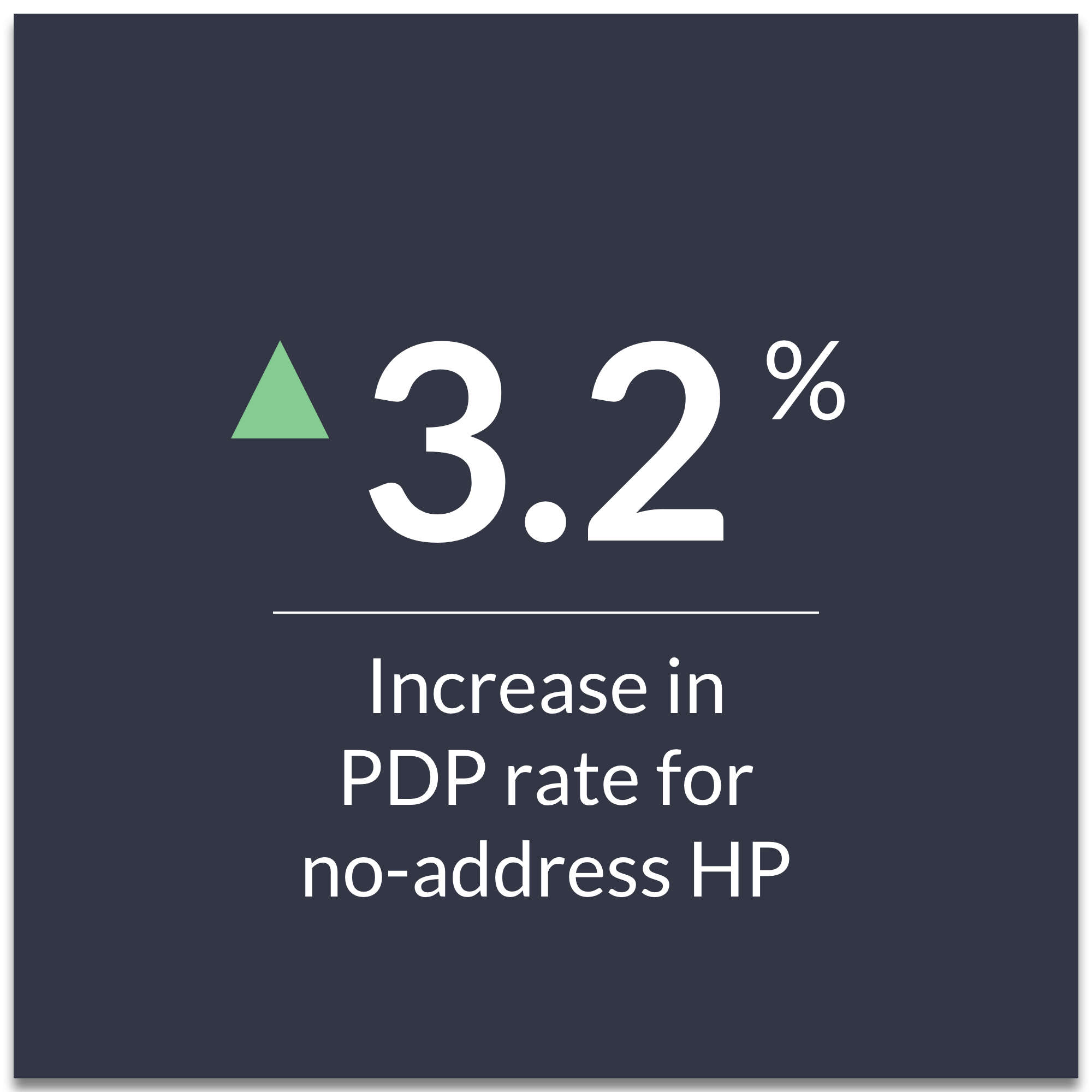
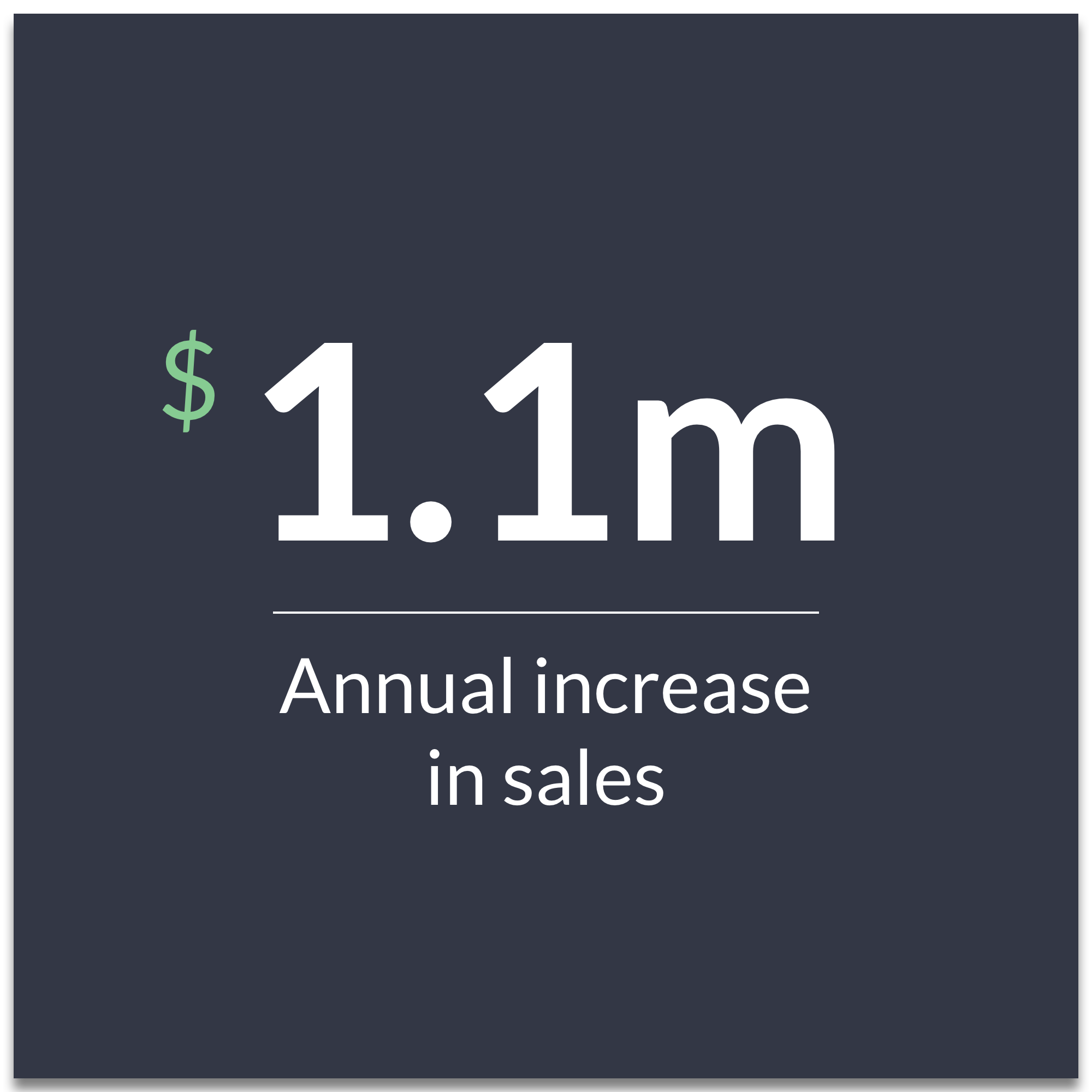
Improved no-address home page
Design also set their sights on the no-address (logged-out) home page. Historically this page had been designed to push Drizly as a lifestyle brand. Images of people enjoying themselves adorned the page. There was no copy to discuss the benefits of shopping with Drizly and there were no products offered up. This page had a lot of stakeholders from different orgs. Conducting internal interviews to ascertain objectives, we realized there were many competing goals of the page (and it showed).
Working through all of the inputs, we narrowed the new design’s focus to user and business objectives. Users want to find a product. Drizly wants to help them do that. After a lot of design exploration (and user testing), we hit upon a design that was simple and product focused.

This new design was a winner. It drove engagement: PDP rate was up 3.2% against control. This meant an annual increase of $1.4 million in annual sales. It also allowed us to place ad units on the page which was an additional increase in revenue. We’ve iterated on the design since it’s launch in 2022 and continue to see improvements.

The Result
The Drizly design team has transformed itself since I joined. We tripled in size from the original 3 designers on staff. We realigned ourselves to integrate more closely with engineering squads and help product define and solve the challenges in front of us. We’ve added capabilities - User Research and most recently Content Strategy - to offer a broader range of tools and ways to support the organization.
No more a collection of ICs, we help direct work and deliver meaningful business results. Millions of dollars attributed to projects championed, defined, and designed by Design. We actively support initiatives across the company: Consumer, Retailer, Supplier (ads), Corporate, CX, collaborate with Marketing and Brand. Most importantly, we’re delivering a better experience for our consumers and retailers.
View more of my work