DraftKings
Daily Fantasy Sports Gaming
Work detailed here was completed in 2017.
In 2016 I joined DraftKings [link to DraftKings] as Director of User Experience. The company was making the transition from a startup to a more rigorous and professional company. I was the first Product Design Lead brought in and was immediately set about improving the overall design quality and game experience for users.
Product Quality
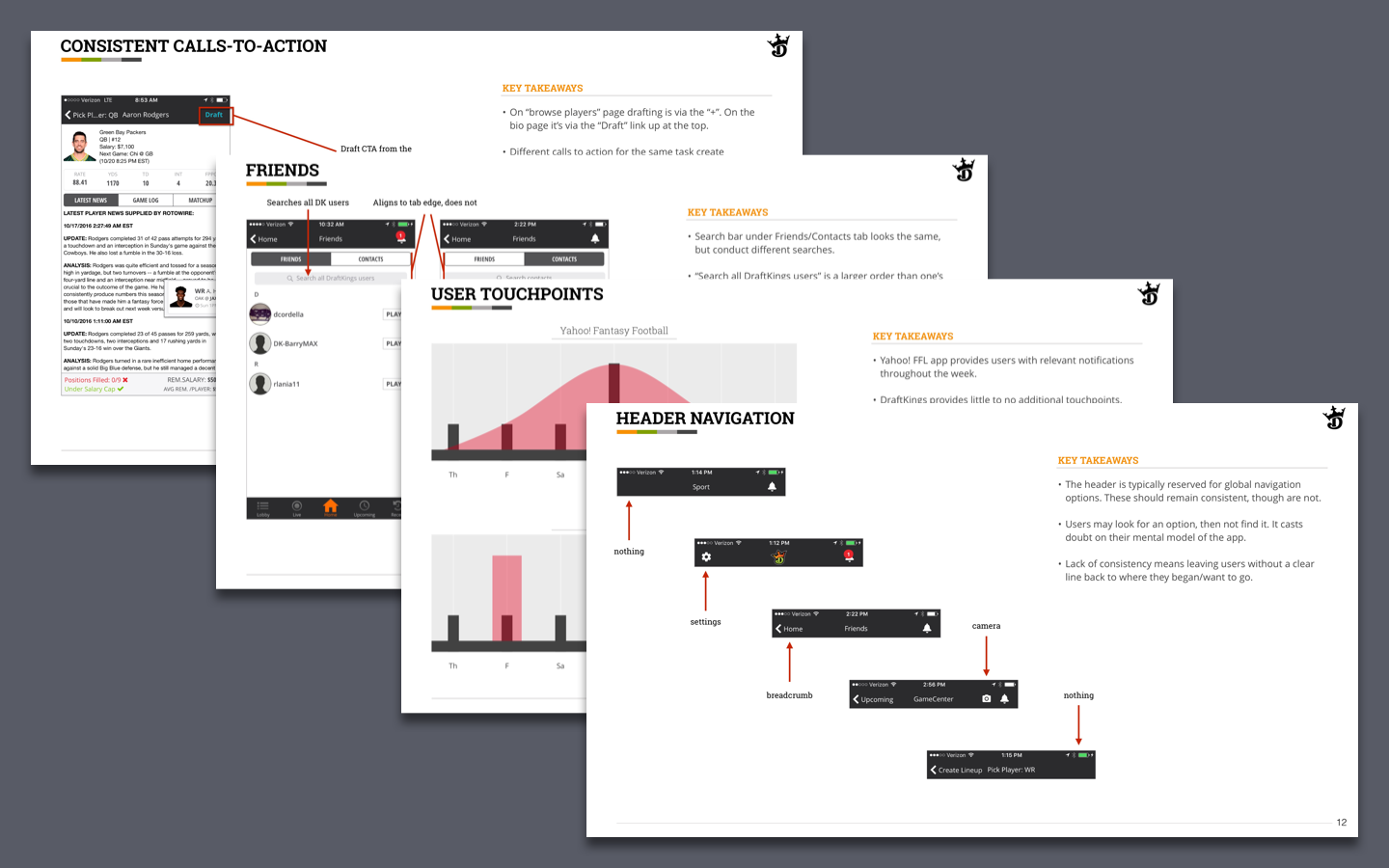
One of the first things I did was complete a heuristic evaluation of the mobile platform and present to company leadership. In this report, I identified things that worked, did not, and seemed odd from a user’s perspective (admittedly, I was not an avid daily fantasy player and so I had an outsider’s perspective). I also included examples of best-in-class examples from comparators and competitors. We identified from this several bugs related to depositing and location services that were immediately fixed.
From the initial success of this initiative, we developed a “Fresh Eyes” program. Each new hire within the product team (PO, UX, Dev) would do a similar exercise of reviewing a part of the experience and identifying what seemed to work or didn’t, from an outsider’s perspective. We were able to identify and fix a number of within their first month at DraftKings. It proved to be a valuable prospective, allowing us to see our product from a different point of view.
From this I spearheaded a UX bug tracker. This was meant to capture inconsistencies, bugs, and just general bad design across the many platforms of DraftKings. All of these issues would be considered “minor” from a traditional development process, but it helped give us focus on ways to level up the experience in meaningful ways. I worked with POs across the organization to help prioritize these findings and include them in ongoing sprint work.
Game Improvements
Another practice I began to implement was prototype hallway testing. When I got to DraftKings, there wasn’t a formal user testing process. I began building prototypes with my team and testing them with people inside the company, usually outside the product development teams. We would take an hour and recruit 5 people to run through a prototype, observing how they interacted with the prototype and asking questions.
A big initiative we undertook was launching game variants - daily fantasy contests that had different rules to allow more interesting ways to play. This was specifically aimed at attracting new, more casual fans of daily fantasy.
A potential sticking point for this audience was understanding what different slates of games were available (or meant) and how to find a relevant contest.
We cleaned up the game slate headers to be more more easily scanned and moved some selections to their own screens, allowing users to more focus on the task at hand.
These tweaks greatly improved contest entry for users, particularly among casual fans. The new Lobby flow has been successful and allowed us to introduce a wide range of playing options to users.
The updated lobby flow with game variant option
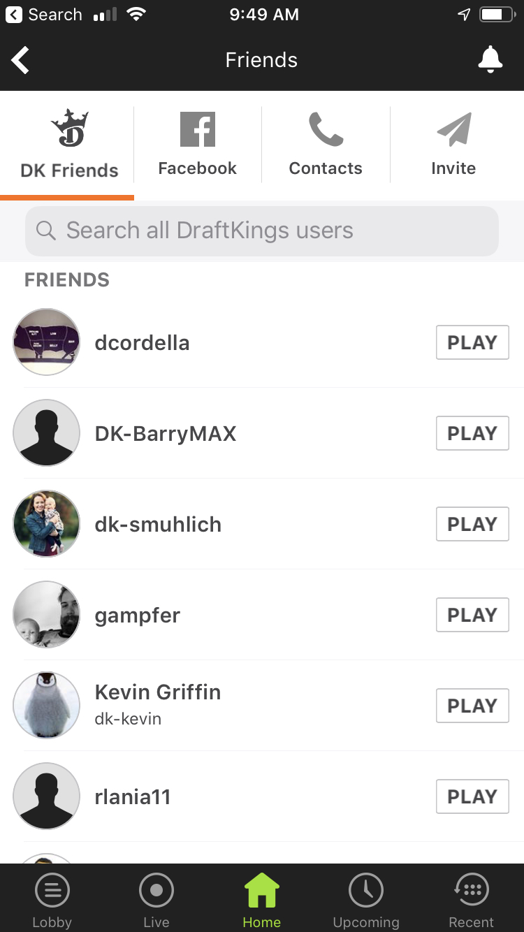
We redesigned the friends section of the app to improve the ability to add users, adding Facebook connect and making the overall functionality easier for users.
Design + Development together
What these examples have in common - renewed focus on improving quality across the multiple platforms and engaging in perpetual gameplay improvement - is a partnership between UX/Design and engineering. I put a lot of hard work into forging relationships with Product Owners, Technology Leads, developers, and data analysts. Bringing all of these different disciplines into alignment for a common goal and understanding helped us improve the game we were building and ensuring the quality we put out was consistently improving.

