Improving Customer Service
Influencing user behavior through thoughtful design
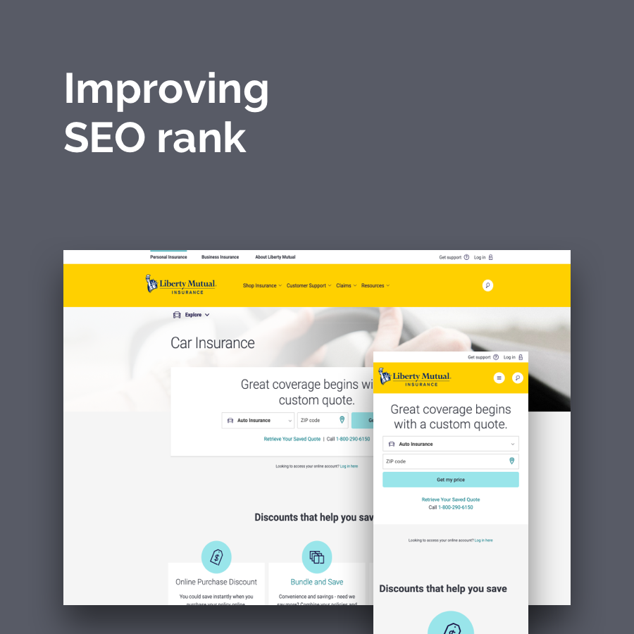
Liberty Mutual is a global company with millions of customers and millions more prospective customers. Insurance is a sometimes confusing product that most people don’t like to think about, nor do they typically understand very well. This makes it a challenging product for customers and prospects to shop for and manage themselves. It can lead to confusion and drive millions of people to call the company to help.
Why this matters
Designing a better customer service experience offers two important benefits for Liberty Mutual: First, it helps users answer their questions faster and more effectively. Second, it reduces calls into the call center which saves the company money.
the team
Jason Bushey, UX Lead
Brian Hood, Content Strategist
Dan Roge, Product Designer
The Challenge
The collection of Customer support pages that existed on libertymutual.com in 2017 were poorly designed and confusing. There were multiple pages with similar names but serving up slightly different information:
Customer Support
Contact Us
Resources
FAQs
It was hard for visitors to get answers to their questions online, and so many called. Liberty Mutual wanted to reduce these calls because of the cost to the company. Increasing online self-service was business critical.
A Simple Experiment
We looked at the “Contact Us” page which was the biggest driver of calls into the Liberty Mutual call center. This page was poorly designed and already likely laid out in a way that would theoretically reduce calls. The phone number was buried at the bottom of a long page where all manner of other contact options were offered first, including broken online form submission links and a mailing address to send requests.
After reviewing the analytics and conducting numerous customer interviews, our hypothesis was that users called because they were frustrated as opposed to disuaded by the struggle to find contact information. How might we serve the user online and would it follow that calls dropped?
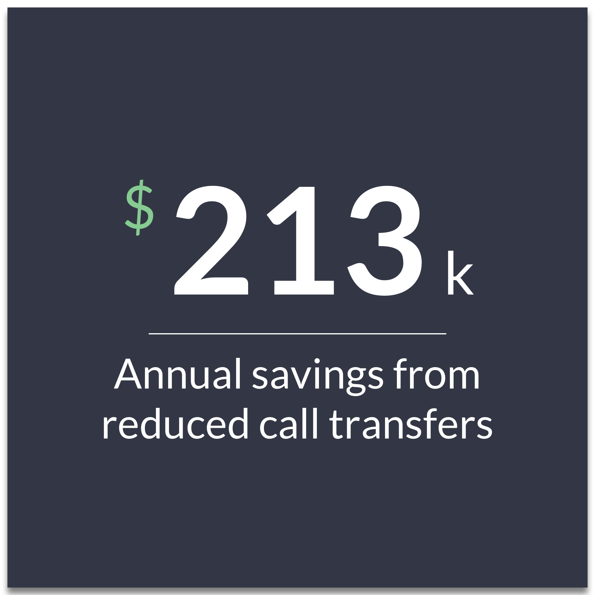
One data point that stood out to us was the high propensity for call transfers. When a user looking to get a quote reaches a customer service representative. they need to be transferred to a sales associate. Similarly if someone looking for service reaches a sales associate, they need to be switched to a customer service representative. Liberty assigns a cost to these transfers, about $3.50/transfer. Calls generated via the “Contact Us” page had a very high percentage of call transfers.

Contact Us, 2017 | FAQ and quote module at top; mailing address in the middle, phone number at the bottom
We ran a simple A/B test where we added the headers “Sales Questions” and “Customer Support” to the appropriate sections. The results were dramatic. With Control (no headers) calls were split evenly between sales and service ( 571 for sales vs. 452 for service). With test (headers) the split was dramatically weighted towards service (852 for service vs 29 for sales). The headers essentially eliminated the need for switching users.

Winning test with section headers
This little experiment was a big win for Liberty and immediately reduced costs by reducing the cost of call transfers. There was also a small but noticeable reduction in calls. We felt this proved our hypothesis that users were calling out of frustration, not because it was easy.
Reducing Clutter; Helping Users
Having demonstrated that good UX can support business goals, we moved on to redesigning the Contact Us page, as well as the larger set of customer service-related pages. We wanted to reduce the number of confusing pages - reduce the potential dead ends - so that it was more likely the user would find the information for which they were searching.
We collapsed multiple service-related pages down to a single “customer support” page. Leveraging good information architecture backed by customer research and analytics, we devised a tab component that allowed us to group and display desired groups of support - Customer, Sales, and Claims - on the same page. One navigation point, multiple related content.
We also inserted “log in” buttons where it would be logical to prompt the user to log in. We added them to FAQ answers. We prominently displayed it on the support page. We included a large promotion for downloading the Liberty Mutual app. All of this together helped reduce calls and confusion, and encouraged logging in.

Customer Support, 2019
In reducing the number of service-related pages, we also updated the navigation to reflect a more streamlined experience. Where the header had contained numerous links to these pages, the current experience has a single customer support link.

Additional Experimentation
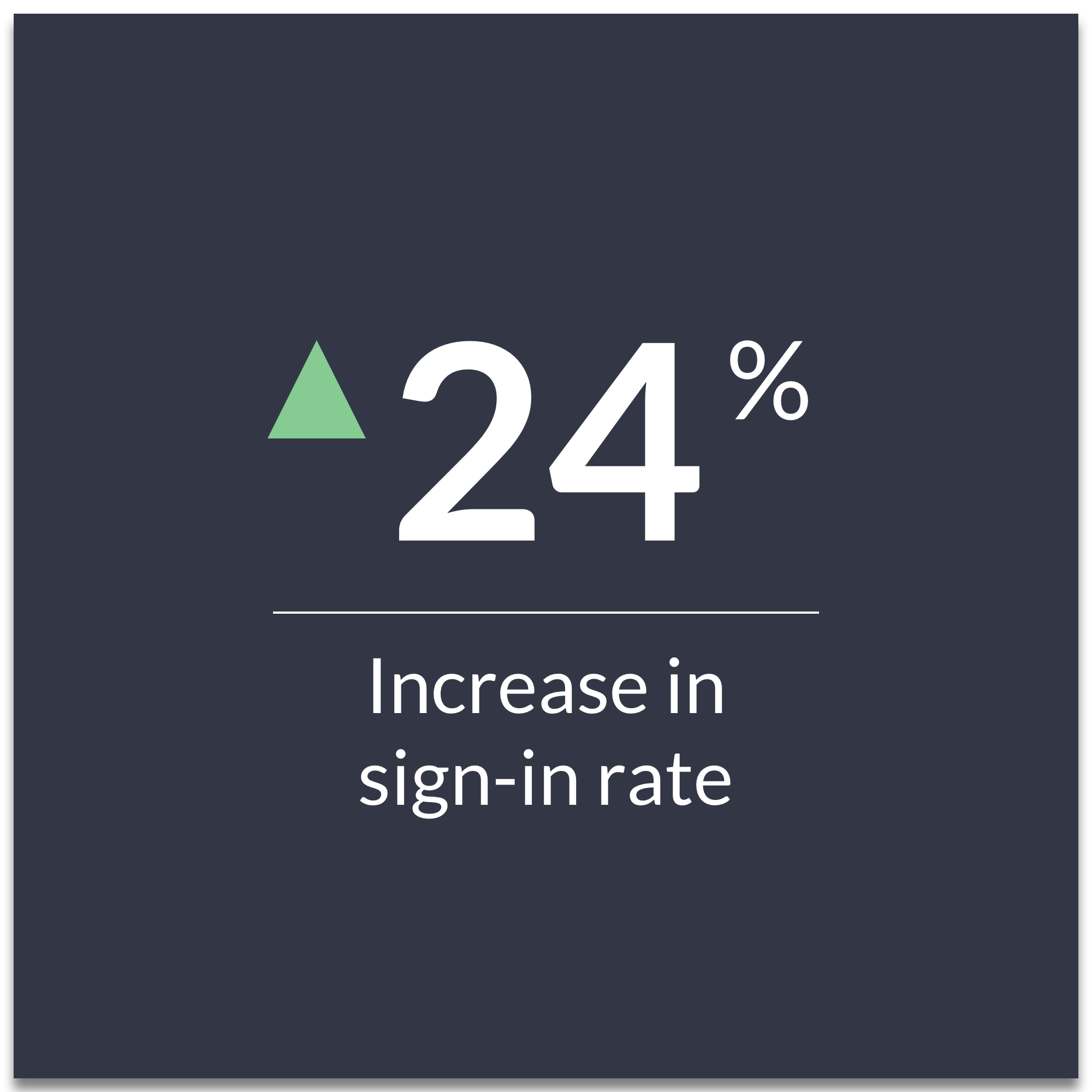
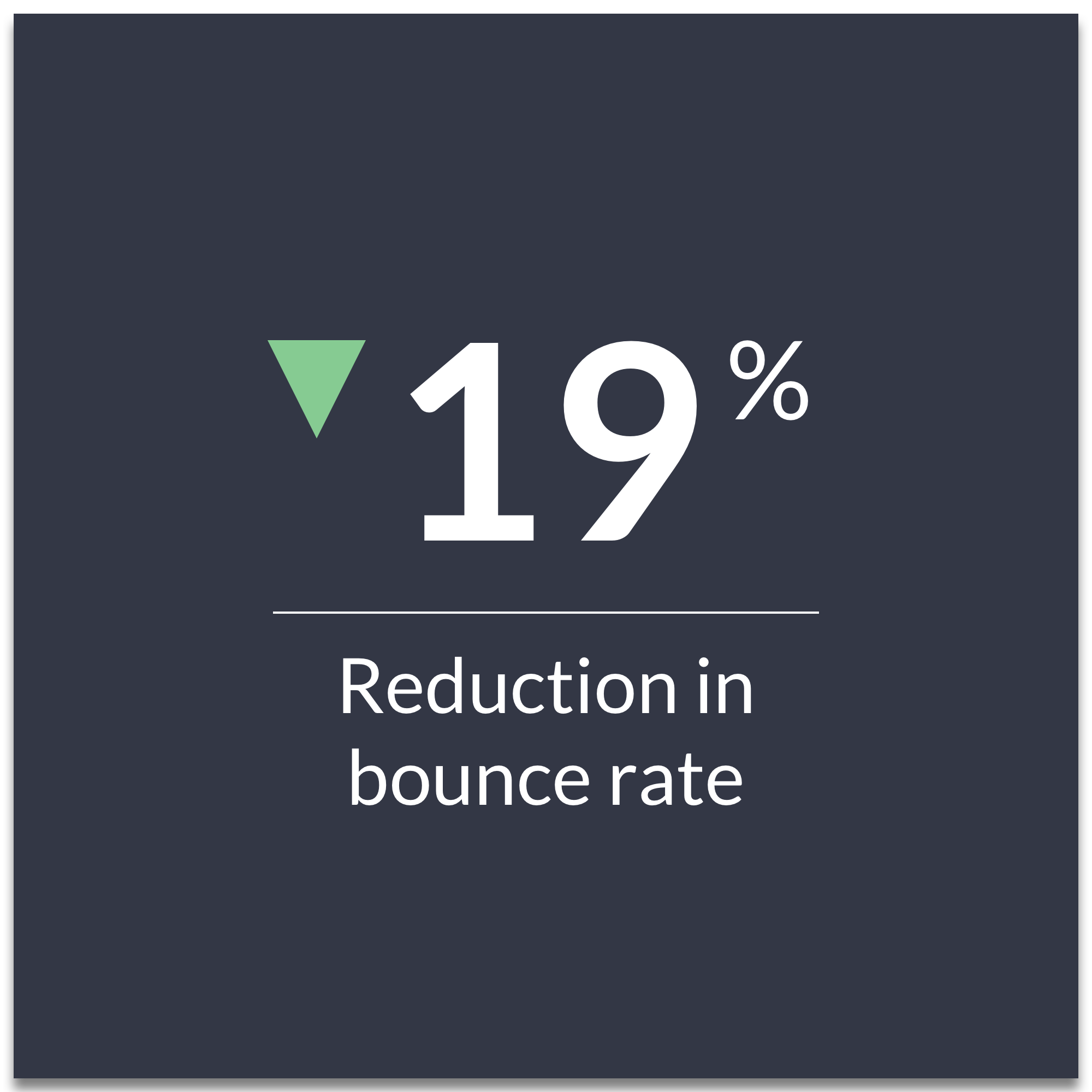
We continued to experiment and refine our digital customer service experience. In 2019 we launched a Chatbot called “Digital Alex” which lived only on the customer support page. Built with a simple conversation tree, we were able to provide answers and direction to users. We ran an A/B test of the updated customer support page with and without the chatbot. “Digital Alex” resulted in:
27% decrease in calls
8% increase in sign-ins
8% of all users interacted with Alex

Digital Alex, 2019
Result
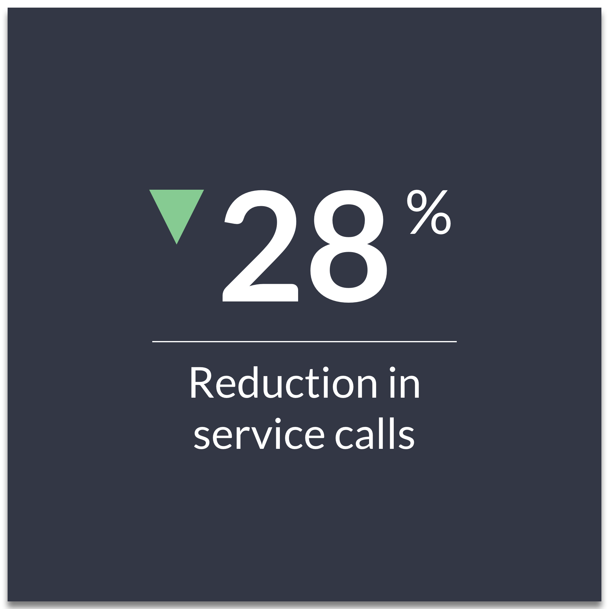
We had entered 2019 with the objective of reducing calls by 120,000 for the year. Through our efforts at redesigning the customer support experience, we had reduced calls by 180,000 by September. The results are quite conclusive.

Customer Support, 2020
View more of my work