No UI is a good thing

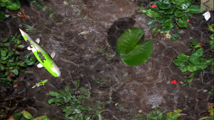
Pocket Pond is an iPad and iPhone game that is exactly what it’s name implies: a pond — with fish and lily pads — that lives on your Apple device.


I came across this app recently while waiting for a doctor to insert an IV into my 22 month old daughter. Lucy is fine, a little scare and a long day, but ultimately all better. The nurses loaned us an iPad to entertain her and Pocket Pond was loaded on it.

The game involves users “touching” the water surface. It disturbs the fish and they scatter. There’s a pleasant sound of water splashing as users interact with the app. Lucy loved it. It occupied and entertained her while we waited hours.

It is a very simple game. But what I found interesting about it was the app had almost no UI. The entire screen was filled up by the pond and that’s what you interacted with.

I’m a UX designer. I’ve designed a number of apps, websites, large-screen displays. We are always focused on creating the UI. How do people interact with it, control it, understand what’s possible. To our detriment as designers, the UI is immediately what we focus on. Pocket Pond has none of that. It just is. It’s skeuomorphic design is exactly the point.


Petite démo de Pocket Pond HD pour iPad


Wherever you touch the app, the water is appropriately disturbed. That is the interface. And it supports multi-touch so touching with just a finger produces a different result than touching with all five or your palm. It “feels” real.

Important to the experience is the sound. The sound is both what one would expect, and soothing. The sound helps create the immersive experience. Playing the game without sound provides a lesser, duller experience.


So what’s the point?

The game is certainly simple in what it wants of users (see the part where my young daughter was highly entertained). But that simplicity allows for something interesting to occur.

My daughter experienced real joy with the app, and unlike every other app on my phone, she could play it without unintentionally ending the experience or going down a path that locks out the game (e.g. opening a menu, selecting an alternative option screen, etc.).

And I actually found the game refreshing and oddly entertaining. Immersion can be a powerful experience. There is real opportunity in building apps in this way, or at least incorporating this experience into a larger platform.

I think three things overlap and work together to create this experience:


No UI

The lack of UI is a benefit. I don’t need to understand how to use the app because the experience as presented is it’s whole purpose. Just interact with it. You can’t create an error. How do you create an error with a pond?

And this leads to…


Immersive

Without the UI to get in the way, the user is that much closer to the “pond” experience. Sound, as noted above, is also extremely important. They work together to bring the user into that world. It is surprisingly powerful.


Fun for it’s own sake

The app has little to no purpose other than to replicate a pond. Users find joy in that (or don’t). There’s no effort to make the user do something, to progress by completing tasks.


Conclusion

There is a notion that mobile users are task-oriented. They want to open an app, complete a goal, and move on. At the same time all of us are spending increasingly more time on our phones. Might there be an opportunity to build more engaging apps that eschew UI and focus on immersion? Pocket Pond aspires to be little more than the simple game of splashing water and scattering fish. But this approach seems to be rich with experiences that could be more rewarding. And experience in and of itself is a worthwhile end goal.

I would certainly enjoy more apps like this.

How do we make decisions?

Over the weekend I saw this tweet from Andrew Wilkinson:

I love this idea. It connected to me in an unexpected way. I've been spending a lot of cycles thinking about decision-making. Over the past few years as a UX lead - first at Sapient and now at DraftKings - I've helped shape team structure and process. I'd grown into this responsibility as I progressed in my career. But no time was spent training me on how to build process. Sure, I have experiences - been in good situations where the team delivered exceptionally and bad situations where the projects was a shit-show from top to bottom - but that's not a study of process.

Also, to some extent I distrust experience as a way of making decisions. This is for two reasons. First, I haven't had all the experiences there are to have. In terms of experience I'm missing pieces. So how can I build a process based on only what I've seen? Second, I've seen others make bad design decisions based on their experiences. Choices I would not agree with based on my direct experiences. So if I see others making bad decisions and they don't know better, why would I think I'm not doing the same thing.

So I'm thinking about decision-making as a repeatable process where, if followed, I can be as sure as possible that I'm generally going about it the right way. Which is why Andrew's tweet struck me as interesting. Is there a way that decision-making can be defined clearly enough to ensure a good (or more likely good) outcome?

I think so. Though I don't know what that looks like at the moment. Responses to Andrew's tweet suggested several apps/sites out there that offer help, though I found the approaches they take lacking. In some form or another, they treated making a decision as a simple math equation. Input relevant facts, weight them, the app spits out an answer. That doesn't feel right. That doesn't feel like how decisions are made. They can't be reduced to simple either/or statements. I think evaluating and contemplation are necessary parts.

I'm going to think some more about this idea. I think it's interesting, and valuable. I need to work through what this service might look like.

UI & UX: The Toaster Oven Problem

A toaster oven is a good idea in theory. One kitchen appliance to make toast and cook things. It’s a space saver.

But a toaster oven doesn’t make toast as well as a true toaster. It takes longer to toast and the bread usually toasts unevenly. And the oven part… well you can’t really cook things in it. It’s pretty small. And not nearly as powerful as actual ovens. It basically can warm things up, though this takes longer than another kitchen appliance: a microwave.

A toaster oven isn’t the best tool for making toast. Nor is it the best tool for baking. It doesn’t do any one thing particularly well. But it’s a space saver.

Which brings me to UI and UX. UI — short for User Interface design — focuses on the visual design of a screen. It is the digital “thing” that a user will interact with. UX — short for User Experience design — focuses on the experience in total for a user. It is about how to make completing a task easier, more intuitive for a user. These are not the same areas of focus.

This is how Golden Krishna, author of The Best Interface is No Interface, recently described this difference on the Intercom podcast:

UX slash [sic] UI roles… they aren’t the same thing. When you’re a UI designer you’re there to compose a great screen and when you’re a UX designer you’re there to understand and solve problems. When you conflate the two you make it so people try to solve problems with screens.

Krishna’s exactly right. UI and UX look to solve different problems using different approaches. UI is singularly attentive to a single space (the screen) and so must confine its solutions to that arena. UX is obsessed with the user and so may consider the screen, but also think beyond, wherever the research and insights take them (environment, flow, objectives, etc). How one approaches a problem will dictate the solution. Or to use an analogy — when you’re holding a hammer, everything starts to look like a nail.

Can a single designer inhabit both roles? As one who’s interviewed a lot of designers — UI, UX, and UI/UX — I am dubious. More and more I see designers marketing themselves as being both — the holistic UI/UX designer. And there’s a certain logic to it. A UI designer necessarily must consider the UX of the screen when working. It seems on the surface a harmless stretch to suggest one has UX ability as well. Certainly you look more appealing on paper and also open yourself up to more potential opportunities.

In interviewing such candidates, I find the a few perfunctory questions about process and how the designer addressed a particular project usually reveals immediately what side of the fence they truly belong. And what I find usually is they have passible ability in one area, better than average in the other. Never have I found a candidate to be exceptional in one area, and ok in the other.

A truly great UI designer states unequivocally that they specialize in User Interface design. He/she leads with their greatest strength. The exceptional UX designer does the same. It is the mediocre designer that claims mastery of both fields.

The toaster oven problem.

Companies deserve criticism for this issue as well. Job boards are filled with postings for UI/UX designers. Generally, these illustrate the company’s misunderstanding of the two roles. But hey, 1 salary for two roles! Ultimately both roles receive short shrift for the sake of expediency.

Now, it is certainly true that, while rare, there are a few exceptionally talented individuals who can serve both masters: UI and UX. But I have not seen a company yet willing to pay what that unique combination of talent is truly worth. Companies devalue the worth of designers in this manner.

Let’s recognize that UI and UX are different things. They are not skills that exist on the same spectrum. Rather, they intersect. These roles should be properly maintained by two separate designers.

And now for something completely different

Well, I’m making a (kind of big) change.

After 10+ years in the agency world, I’m moving to the product side of things. Starting next week I’m going to lead UX at DraftKings.

I’m really, really excited about this opportunity. I’m also pretty nervous about it too.

FIRST… GOODBYE TO A GREAT PLACE

For the past four years, I’ve called SapientNitro my (work) home. It has been a great company to work for and I’ve had the opportunity to work with many big name brands on challenging and consequential projects. I’ve learned a lot about design. Hell, I even owe being back in Boston to Sapient. I was living in Chicago at the time I met with their recruiter. My wife and I wanted to move back; Sapient made it happen.

Most of all though, I’m going to miss the friends I’ve made, both current and past coworkers. The people at Sapient are a passionate, talented group of people who are just really good, fun people to hang with. I’m going to miss seeing them every day.

A CHANCE TO BUILD PRODUCT

The biggest thing about this change is getting to focus on a single product. Learn what users like, what they don’t, always focused on improving. DraftKings is already a widely used and really successful app. The prospect of working on this with other really talented people, striving to improve, evolve it, is incredible.

A few years ago I had a chance to “build product” on an internal project at Sapient. I wrote about some of my experiences and learnings here. We did a lot of things wrong on that project. But it was a demarcation point for me, as it got me thinking constantly about product design and process. First, I had loved working on a single product and working to make it engaging. Second, I began to appreciate how much process and and methodology impact the outcome, over pure talent and hard work. Or to put it differently, how you empower and direct talent and hard work are huge factors for success. Now I get to focus on these things full time.

BOARDING A ROCKET IN FLIGHT

DraftKings has been around for just 4 years. They already have millions of daily users. I’m joining a team that has done an amazing job building a product that a lot of people want — and are passionate about — in an incredibly short amount of time.

I’m really excited about joining this rockstar team. And while everyone appreciates the success they’ve achieved, they also want to improve, to learn, to get better. That inspires me. To find a group of people committed to always be improving. I am going to learn a lot from them.

A SCARY PROPOSITION

DraftKings is hugely successful. I better not fuck that up.

I confess that I am nervous about this move. It is doing something different from what I have been doing. It comes with a lot of responsibility and a lot of challenges. What if my ideas or approaches are wrong?

I am joining a successful and talented team (see above) and I trust that together we can figure out the right moves and make good decisions. And also learn from the wrong ones. Still though… butterflies.

BUILDING A TOP-FLIGHT DESIGN TEAM

One of my tasks will be to build and lead the UX team. There’s already a great foundation. This is an awesome responsibility. I’ve had experience building and training the team at Sapient, but this is going to another level. It’s a huge ask. I’m excited; nervous (again).

So if you’re focused on UX in Boston and want to work on an important product, reach out. Let’s build connections and get to know each other.

So now I move to DraftKings. I can’t wait. I am invigorated by the challenge and opportunity. I don’t know what’s in store for me on this journey, but I’m sure it will be an incredible ride.


This post originally appeared on Medium here.

Cult of personality (testing)

Image credit: The Huffington Post

Question for creative directors and other design leads: do you use personality tests as part of your hiring process?

On a recent “Seeking Wisdom” podcast* about how to hire talent, David Cancel stated that he has candidates (and employees) take a personality test when joining his company, Drift. Specifically, he mentioned a free online site called 16Personalities.com.

*He starts talking about personality tests at the 17:00 minute mark.


When I heard this, I first hot take: “I get it, but it sounds a little creepy.” No one wants to be defined by the results of some test psychologists (or not) made up. I’m more than the results of some multiple choice survey.

But I continued to think about it. As a creative director and team lead, I recognize implicitly that I can’t manage everyone exactly the same. People respond to different management styles and interactions. I view it as my job to learn what style works best for each individual and adapt my approach accordingly.

I think back to the teams I’ve lead over the past few years. I’ve had both extremely extroverted designers and others that were quite shy. Some do well in a group setting where ideas are being explored and others I could get more out of with 1:1 discussions about the work. I would always encourage discussion from those that would sit quietly (and sometimes get the more outspoken members to dial it back a little). What I’ve learned is that the work is greatest when the team collectively contributes. So I have tailored what I say and do to each person working on my team.

*for a great long read on team dynamics and better production, check out this NYT Magazine piece about Google’s research into how to build the perfect team.

And this is Cancel’s point. To be an effective manager, you have to recognize that each designer, developer, etc. is different; manage appropriately.

So I took the 16Personalities.com test. This was my first time taking such a test.

My result is ENFJ-A

16Personalities.com labels me as a protagonist personality.

“Protagonists are natural-born leaders, full of passion and charisma.”

I confess, I feel like sharing that is a bit of a humble brag. But the takeaway is that I felt the description was true about me (though I don’t think of myself as extroverted as the result suggests… ok THAT was a humblebrag).

The result was for me indicative of my personality (or so I think). And if that’s the case, it can possibly point the way to other testers. And information like this is helpful in managing people.

my test results

my test results

I don’t think a manager should consider the result of a personality test as ironclad. New information and insights about a person and their behavior will always be forthcoming and a good leader needs to recognize that and continue to evolve their approach. I don’t know that I like the idea of using the test as deciding factor in hiring. But I do think it can help the manager better manage people.

So back to my original question: anyone out there using personality tests in hiring?

At my company — a large, global agency, I don’t think the lawyers that be would allow me to incorporate this tool (to be fair, I’ve not asked). I suspect anyone I brought this to would stop at my own initial thought. But I think using such a tool in the proper way, and properly weighted (which is to say, not definitive), it could be a valuable tool.

What does everyone else think?

UX portfolios suck

They are poor representations of what UX designers do

My new logo... maybe?

After working on a logo design for Boston Made (read about it here), I decided to try my hand at designing a logo for myself. Here’s what I came up with: 

In working on this, I was greatly influenced by the (relatively) new Google Ventures logo:

I love how the negative space and the shearing off of the “G” at the same angle as the “V” creates the illusion of the full letter appearing. I think it’s brilliant.

I wanted to create the same effect with my logo, but couldn’t quite figure it out (or if there’s a way to do it?). Nothing I put together worked. Hey, I’m not a visual designer.

Anyways, it was fun to experiment. What do you think? I’d love to get any feedback/impressions of my new logo. Feel free to comment.

And thanks!

My Blind Spot in Creating a Product Team

An interesting conversation the other day, and one that made me think. A designer on our product team gave his notice and so we had a role to fill. I brought this up at our weekly project leadership meeting. We have a few weeks to fill the role, and I needed to get started on it.

A few facts about our project:

  • We’re an agency working scrum for our client (and doing quite well, I’ll add). Our team consists of about 15 people. The product owner, is from the client and works from our office every day to be available and make decisions.
  • As an agency, we have a bench of talented designers, developers, content strategists, copywriters, etc. from which to pull a resource. In this particular case, we need to replace a visual designer.
  • We’re entering a new phase of the project, wherein we’re close to launching release 1 of the product. The client would like to continue working with us on related and additional projects, but has asked us to slim the team down to bring our weekly run-rate down. Also, through various reasons, we’ve had some churn already on the team with several people coming and going.

As we were leaving our meeting, one of the leads asked if we could talk about the role. I said, “sure” and we ducked into an empty conference room.

As we began, she pointed out to me the following:

  • Two people had recently rolled off the project for totally benign reasons (one took another job, the other because we needed to reduce the size of the team). Both were female.
  • We just rolled on a new team member to take over for another planning to leave the company next month. The departing team member is male; his replacement is too.
  • In filling that role, we had considered another potential replacement — who was female. Both were qualified and would do the job well.
  • The current make-up of the team is all male team members.

The lead asked me that in filling the new role, “Could you try to replace him with a female designer?”

None of this had occurred to me. I hadn’t noticed that the team was now all male (with the exception of several leads). I was truly shocked when she made this point to me.

And I’m glad that she did.

For various reasons — practical ones — diversity of experience and backgrounds make for better-designed products. On this project, we work in scrum where designers, QA, developers all work together so that we get to a better solution more quickly. That is because multiple perspectives come to bear on the problem(s) at hand. The benefit of these diverse perspectives does not come just from skillsets, but from the individuals themselves. So startled by this realization, I agree that we should fill the role with a qualified woman.

And I’m disappointed that it appears we will not be doing so.

I brought this issue with me to staffing as we worked to identify a replacement. All agreed that this is a worthwhile point to consider. Yet we still landed on a designer who was male. To be clear, this replacement is quite talented and should do very well in the role. Additionally, there were no female candidates in the immediate designer pool who had the seniority and experience required for the role.

I want to state that I was part of the decision and agree with it in this case. I am not laying the decision at the feet of others while distancing myself.

I just don’t feel good about having made the right decision here.

I share all of this because I believe it’s an important and too subtle thing that is easily missed. I am grateful for being reminded of it by my fellow lead. It is something I will endeavor to keep in mind in future allocation discussions. And I hope too that by sharing, it may equally resonate with others who, well-intended, may not think about this at first pass.

Launching Boston Made

This week I’m launching BOSTON MADE. It’s a side project born out of a Slack discussion. The idea behind it is to show our pride in making great things right here in Boston.

What is Boston Made?

Boston Made is a rallying cry for Boston. It represents to the world that Boston is the place to build great companies, develop new technologies, create amazing work. Boston Made tells the world that this is where the future is being constructed.

Who is Boston Made for?

If you’re an entrepreneur, a maker, a developer, a designer, an investor, a blogger in or around Boston, this is for you. You’re doing the hard work to make Boston ever better.

What do I need to do?

Just add the Boston Made badge to the footer of your website. You can download it here. There are 2 versions of the badge, in black (Boston Made — Positive) and white (Boston Made — Negative). Use whichever badge works best with your site.

Where did the Boston Made idea come from?

It started as a discussion in the Tech in Boston Slack channel. People were talking about showing our pride for building companies from Boston. I thought it was a cool idea and would be fun to work on. I tested several iterations of the badge with the channel, getting great feedback and encouragement.

What's your plan for Boston Made?

My hope is to contribute to the startup community here in Boston. I’d love to help promote, encourage, and connect great people and companies.

On the TiB podcastDave Gerhardt always ends with asking his guests what the Boston Startup community can do better. The answer is almost always “we need to promote ourselves more.” My hope is that Boston Made can help just a little with that.

Why did you make Boston Made?

Because it’s fun! Side projects are worthwhile and reward you for the effort. I’m not a visual designer. This was an opportunity to try my hand at a different skill. I enjoyed it, and learned a few things. I recommend you try a side project too!


Get your badge at BostonMade.org today!

Also check out the Boston Made Facebook page.

Pa22w0rd$ - we can do better

I’ve recently been thinking a bit about passwords. They really are an inferior method of securing our digital selves. Passwords cause a lot of hassle for users, and in fact, they’re counter-productive. That is to say — the stronger you make your password, the harder it is to use. You can even graph this:

The way to make your password stronger (less easily guessed) is to make it less comprehensible to humans (hackers are humans). But that’s also the problem (you’re a human too).

I’ve been designing ecommerce sites that require secure login for a number of years now and at some point in the project the topic of password security always comes up. Sometimes brands have an established guideline for password strength set by an internal security team. Sometimes we make up the rules in the course of the site design. What is always the case however is that we design two ways of logging into the site: The first is the password login flow (obviously). The second is the password recovery flow.

We take it as a fait accompli that users will forget their passwords at some point. So we design a backdoor into the site via password recovery. What we fail to recognize is that this is a legitimate method of entry into a site, and possibly simpler.

I’ve suggested this approach to clients before (Medium implemented this feature for their email login a year ago). Particularly for sites with infrequent logins, this approach seems viable. If it’s a site for which you can’t remember your password, you’re probably already using this method by default.

If we think of password recovery less about resetting a password and more as an authentication flow, we could craft a more secure experience that is also more user friendly.

There are certainly several challenges with this approach.

Single point of failure

If everything routes through a user’s email, then obtaining access to that email give one access to everything. This is true… but it’s also true already. We already use our email to recover passwords so that vulnerability exists. It falls to Google and other to keep working on protecting our emails.

Delayed entrance

We’ve all waited for that reset password email to arrive. And wait, and wait, and let’s hit refresh again, and still not here… It would add time to the process of logging in.


Password recovery as login is one path to replacing passwords. It may not (and probably is not) the best solution. Google is looking into ways of replacing passwords and hope to ditch them completely by the end of 2016. Their approach is by utilizing a collection of lightweight security checks together. Each one by itself would not be secure, but combining several of them together provides greater strength than passwords offer.

Individually weak. Collectively strong.

Individually weak. Collectively strong.

Still for me, the most convenient login happens on my iPhone, when I use Touch ID. My fingerprint gets me into my phone, along with several other apps — no need to remember, or enter my password. No risk of entering my password incorrectly.

Passwords are not user-friendly and offer little in the way of security. Let’s all work to find a better approach.

Atomic Design: fission or fusion?

A first-hand look at applying Atomic Design to a scrum project

I’m currently engaged in an app dev project where we’re using Scrum methodology to design and build. It’s going quite well. As we began the project, development brought up Atomic Design and wanted to add it to our process. I’ve read a lot of Brad Frost’s work on the subject and definitely see the wide ranging benefits of this approach. But from how I understood Atomic Design, it was a style-guide approach that’s employed once a style is defined to maintain consistency across digital platforms and screens.

Can Atomic Design be used as part of your design thinking from the start?

Credit: Brad Frost, Atomic Design

Credit: Brad Frost, Atomic Design

First, the good:

Atomic Design has kept the designers honest. As we’ve built out our components and styles, there’s been occasions where we’ve shifted a label for an input field from left-aligned to center aligned. The particular element was a bit different from other fields and it just felt “right.” But did it really have to be different? No, and we changed it back.

Because we are working in scrum, UX is rushing to stay ahead of dev as they think out the screens that are to come. They’re sketching furiously on whiteboards and then moving on to the next feature. As more of the Atomic Design style guide is fleshed out, our visual designer is able to translate a whiteboard sketch easily into fully designed comps (more on “comps below). There’s less cognitive load on the designer in terms of how to design the sketch. Tellingly, earlier in the project when less of the style guide was defined, the designer struggled a bit working from just a whiteboard sketch. More thought from his end and more detailed work from UX was needed. Now that our style guide is more complete, this extra effort is no longer needed.

Second, the hard:

There’s still some friction between the development side and the design side. We print out comps of the various pages and pin them to gator boards so we can review and react to them. Developers have occasionally remarked, “With Atomic Design we really should never be building out full page comps.” This misses the point.

The blunt fact is that the comps aren’t for developers. As designers, we’re thinking through the requirements and challenges and figuring out the best way to design a solution. This necessarily requires a holistic approach.
 
 We take the comps and and drop them into UXPin and build lightweight prototypes that are used to conduct iterative testing with users. This has greatly informed our designs, resulting in us simplifying, enhancing, and pivoting. This could not be done with small components alone.

We also encountered confusion between development and design about what was intended by the various atoms/molecules/organisms. Both sides are to blame here, and it came out — constructively — in a Sprint retrospective. The result was additional conversation to set expectations and tweak process. This has helped immensely.


Atomic Design is a great framework for development AND design in the building of software. But it does need to be flexible to allow creative exploration and to allow the team (because it’s not just designers) to think about the whole product in context. Amazing design is greater than the sum of its individual parts.

Time is becoming outdated

Might there be a better way to organize our content feeds than by time stamp?

NY Mag just published The Feed is Dying, which got me thinking: are they right?

Well, kind of. It occurs to me (and is pointed out in the post) that most everything on the interwebs is organized in reverse chronology (most recent content first, oldest at the bottom). Twitter, Facebook, Instagram, LinkedIn — most social media platforms are organized this way. There’s the straightforward logic — if people are constantly contributing content to the platform, organize it thusly. Otherwise, how else would you organize it?

It’s funny, Facebook does apply the reverse chronology news feed, although they do offer some curation. People I interact with get more prominence over others I don’t. It’s still in order, but it’s not static. This is most evident if you move from a browser view to your mobile app. Your two feeds aren’t necessarily identical.

I don’t actually mind this. Facebook is a passive browse for me. I’m killing time by scrolling through what my friends are up to. However, I get annoyed when Twitter attempts curation.

My mental model with Twitter is different. I look at Twitter as a much truer news feed — I want to know what’s going on right now when I look at it. My interest in what my friends are doing on Twitter is secondary. So when the “While you were away” feature is in use, I’ll see tweets from 22 minutes ago, 2 hours ago, etc. Imagine if news organizations presented their broadcasts in such a way — curated instead of what’s going on currently. It would present a slightly inaccurate view of the world (insert your Fox News joke here).

Back to the NY Mag post. Is the news feed as we know it dying? I think a better question might be, is there a better way to organize content?

People are starting to experiment is different ways with this. I think Slack is an interesting example in that people create various channels and follow the ones that are relevant to them. They can still see the other feeds, but this is an interesting attempt at self-curation (or maybe collective curation). Chatbots will upend the news feed dynamic because it switches us from a push model (the platform serves us the content) to a pull model (users request specific content).

Slack continues to resist the call to become more of a social media platform, preferring to focus on being the premier business communication platform (despite many, many people coopting this for personal use). And it’s true that each channel in Slack is its own reverse-chronology feed. But I do find it really interesting to think about other ways to organize the content we create and consume.

I’m very interested in seeing how this changes and evolves over the coming years.

MVP 😀 vs. MVP 😠

Minimum Viable Product. So important. So confusing.

MVP means a specific thing.  Very often people and companies, when saying they want to build an MVP mean something different. This is how Jeff Gothelf and Josh Seiden define MVP in their book, Lean UX:

MVPs help test our assumptions – will this tactic achieve the desired outcome? – while minimizing the work we put into unproven ideas. The sooner we can find which features are worth investing in, the sooner we can focus our limited resources on the best solutions to our business problems.
— Jeff Gothelf and Josh Seiden, Lean UX

Think of MVP as a prototype – a tool to help us test and learn. But this is not what is usually meant when people speak of MVP. Confusion starts with the letter “P”.

THE MVP IS NOT YOUR PRODUCT.

The MVP may look a little like your product. It may replicate some of the functionality of your product. But it is not your product.

I kick off projects all the time with clients. We always talk about building an MVP. What they really mean is Release 1 of their product. They want to build something light-weight (or somewhat light-weight; but that’s another post). They have a lot of features planned out on a roadmap. They’ll push the more complicated and challenging ones to Release 2, or after their MVP/Release 1. But most, if not all, of those complicated features will be in a future release. We’ll start working on them as soon as the MVP/Release 1 goes live. Sometimes even before that.

And this is the problem.

An MVP is supposed to help us understand what users want. We are supposed to learn from it and adjust as we build our real product. It is not meant to be the foundation upon which all future releases will be built.

I love this slide explaining how Spotify thinks about product design (this is a popular slide that’s been shared a lot, though I confess that I don’t know if Spotify were the first to use it or not). The point being made is that your product should always deliver on the problem it is intended to solve. So if your product (in the case of the slide) is about transporting someone from point A to point B, ensure that each iteration of your product solves that. A skateboard, a scooter, a bicycle, a motorcycle, and a car all solve this problem. These are all products.

But none of them are MVPs. Which is why I was dismayed when I saw this version of that Spotify slide:

The Spotify slide is labeled addresses the statement: How to build products. This slide shifts that slightly to: how to build a Minimal Viable Product.

That is an important difference.

How did this company helping to “transport someone from point A to point B” figure out people would be comfortable enough to balance on a skateboard as they moved? How did they figure out users would be willing to pay for gasoline to go into their motorcycle when previously there was no additional cost to their product?

None of those releases are MVPs. They’re fully formed products. MVPs were likely used to get to that point, but none of these are MVPs.

MVP is a useful tool for testing one’s hypotheses. They’re meant to help us learn. But they are not products.

Build MVPs 😀. Don’t build MVPs 😠.


Starbucks Mobile Ordering. An update

An update to my recent Starbucks post. I've been using mobile ordering for my morning coffee now for the past week. It's been a huge time saver for me. Where previously I would spend 10-15 minutes in the store, now I'm in and out in about 2-5 minutes. That is a great efficiency for me to find, considering I've been following the same routine for the past 3.5 years.

The only quibble I have is with the store selector aspect of the app. there are a number of Starbucks stores in Boston. And for me to time the order right (so it's ready for me, but hasn't been waiting for me too long), I'm usually nearer to several other stores than the one I'm heading too. Selecting the right store on the map could be better, as currently I'm pinching, zooming, and selecting several stores before I find the right one.

But otherwise, the mobile ordering feature is a hit. And as I argued in my original post, continuing to degrade the in-store experience as mobile customers get priority access over people waiting in line.

Interesting Reads: 4.21.16, Chat Edition

Wanted to share some interesting posts I found this week that relate to bots and conversational design.

The Complete Beginner’s Guide to Chatbots - Matt Schlicht put together a really good resource that discusses the lay of the chatbot land. Goes into detail about the growing opportunity for bots, why that is, and even into how you can build your own chatbot.

Matt has also started a Facebook group dedicated to bots. You can request an invite here.

Startup Shootaround: Making Sense of Voice Technology - The principals at NextView Ventures (Seed-stage venture capital firm based in Boston) transcribed their roundtable discussion about voice technology. Interestingly they address the societal shift wherein people are becoming increasingly comfortable with “talking” to their devices in public, a major hurdle to widespread bot adoption.

“Bot” is the wrong name..And why people who think they are silly are wrong. - Aaron Batalion, partner at Lightspeed Venture Partners, looks at how bots will allow startups to reach a billion users quickly via a commonly used platform such at Facebook Messenger. Key point he makes is that we’re in the (very) early stages of the bot revolution. As it matures we’ll start to see different and more nuanced user interfaces that go beyond simple chat.

How I turned my resume into a bot. (And how you can too!) - I enjoyed this quick post on how Esther, with no coding ability, was able to create a bot that responded via text or Facebook Messenger. Her bot is very rudimentary, but can be easily expanded from there. I will confess that I wasn’t able to complete her step-by-step guide. I think she may have left out a step or two. But you can interact with her bots so she was definitely on to something.

Compassionate UX - When we attempt to index heavily on “delight” things can go horribly wrong. This piece looks at how we as designers/builders sometimes are sometimes blind to what can go wrong, as we’re so focused on what we imagine will go right. It references some recent cringe-worthy screw-ups by big tech companies. The article is not specifically about conversational design (though it looks at the Microsoft Tay incident). Still, a lot of relevant points as we seek to design enjoyable interactive bots.

As a side note, for more on the topic of designing “compassionate experiences” vs. “delightful experiences”, check out "Dear Tech, You Suck at Delight.”  

Why Messaging Bots Won’t Replace Apps - Worthwhile piece on the coming bot explosion. Addresses a question/concern I have that we’re being forced to play within one walled garden (Facebook) or another (WeChat). Allowing the services to be independent of closed platforms will be key.


Starbucks disrupts its in-store experience (on purpose)

Every day on my commute to work, I walk from Rowe’s Wharf where my ferry arrives up to the Downtown Crossing Orange Line T-stop. On the way, I stop at the Starbucks at 125 Summer St. This is every morning, without fail. I go to Starbucks regularly. 

The experience has been getting worse of late, with longer lines and slower service. Yes, the management team has changed over in the past year, with newer people working the registers and making the drinks. Certainly this has contributed to the delays. But I think the problem can be found elsewhere.

I go to Starbucks a lot. Whenever I’m in one, I pay attention to process – how the team behind the counter works to handle the rush of customers. Do they capitalize on all of the possible efficiencies (can this drink be gotten by the person taking the order? Passed along to the barista?). The Starbucks on my commute appears to be getting less efficient. Things are out of whack. But the process hasn’t changed that much. However, what they’re trying to accommodate is a growing influx of mobile orders.

I’ve used mobile ordering several times. It does offer improvements to the experience. Your drink is waiting for you when you get there; no line, no hassle (assuming you’ve timed it right). But since the staff handling the mobile orders is the same that handles in-store orders, an impact is felt. And it’s a negative one. 

Admittedly, this is only a problem at peak-traffic times. But it does hurt my morning routine. I wait longer in the store for my drink (and my drink is always a simple one – regular drip in the winter; iced in the summer).

No doubt Starbucks has looked extensively at the impact of mobile ordering on the in-store experience. And they may still be fine-tuning the experience of how drinks are handled. I think it’s interesting that they’ve introduced a new shopping process that disrupts the old established process.

I think tomorrow I’ll start using mobile-ordering on my mobile commute.

Moving from speech recognition to voice recognition

"Hello, computer."

"Hello, computer."

Conversational Design has (almost) arrived. Voice commands as input device are everywhere. People use it to control their smartphone. Amazon Echo is a success. Speaking offers a speed-to-task completion that beats typing.

And right now it is easily undone by a toddler.

That’s my two-year-old daughter, Avery. She is a typical, boisterous and full-of-energy toddler. When I attempt to use voice commands – to draft a text message, search for a Doc McStuffins YouTube video through Apple TV, whatever – she invariably talks over me. Loudly. And then whatever device I’m using fails miserably.

Speech recognition software has gotten much better recently and so we’re starting to realize the benefits of speaking to our devices. We can all speak faster than we can type. This creates efficiency in how we long it takes us to complete a task. But for this to work, it requires a quiet space.

I’ve been thinking a lot lately about how it will look (er, I mean sound) when we are all talking to our devices. It will get quite loud. The workplace will need to change. We will need to have more privacy to work - to speak with and to our computers. This may, or may not be practical (workspace being a pricey expense). The open space floor plans of most offices will be rejiggered out of necessity to accommodate conversational interfaces.

Out of the office - commuting, traveling, at home, wherever - I see two continuing problems with interacting with our devices. The first is societal. We frown on people talking in public, whether it be on the train, in an elevator, or waiting in line. We consider it rude when the individual vocally intrudes on the group.

Working on this post while riding commuting to work. Yes, I get to ride a ferry every day.

Working on this post while riding commuting to work. Yes, I get to ride a ferry every day.

The second continuing problem is technology. Our devices need to identify not just the words being spoken, but whom is speaking them. Until they can lock in on the user's voice to the exclusion of all other voices, the interface will continue to fail us. It needs to understand that I'm issuing commands and not be distracted by Avery practicing the Happy Birthday song.

That should be the goal. Getting devices to go from speech recognition to actual voice recognition. When that happens, maybe we'll have something.

On the Essential Sameness that Is Competition

Peter Thiel, Courtesy Getty Images

Peter Thiel, Courtesy Getty Images

Just listened to a talk given by Peter Thiel on the “How to Start a Startup” podcast. You can find it on iTunes here. Definitely take the time to listen if you’re interested in starting a company.

Thiel believes that the success of a company is determined by a simple formula:

“For a business to be valuable, two things must be true: you create X dollars of value for the world. You capture Y percent of X.”

X (the size of the market) doesn’t have to necessarily be huge if you capture a large enough percentage of it. He compares the airline industry to online search. Domestic air travel accounts for $195B in revenue annually. Google brings in $50B annually. The search market isn’t much bigger than Google’s share. So which company would you want to be: Google or American Airlines?

 He argues that the goal of every founder/CEO is to establish a monopoly. Do something different from everyone else, go after a niche market and own it. Then expand to related areas, increasing your dominance. Or to put it another way, Amazon started out as an online bookstore. This lead him to another great line: 

“All happy companies are different because they are doing something very unique; all unhappy companies are alike because they fail to escape the essential sameness that is competition.”

He’s repurposing a quote from Leo Tolstoy’s Anna Karenina:

 “All happy families are alike; each unhappy family is unhappy in its own way.” 

I enjoyed Thiel’s talk. He made a lot of great points and expanded his counterintuitive argument that you should not hope for competition but avoid it. Go check it out.


Bad Ad Experiences (part II)

In a recent post I wrote about how poorly designed ads negatively impact the experience users have when visiting a site (and why brands seem to ignore this). Sometimes though, paid advertising can actually undercut a point you’re trying to make.

Slate recently published this post about how Donald Trump’s personal attack on Ted Cruz’s wife signaled a new low for the candidate and the presidential campaign. Its point is pretty clear: attacking Cruz’s wife was purely misogynistic and so far beyond the pale of responsible debate (Slate has written several posts like this about Trump, such as this one that states his only consistent position is misogyny).

And then you get to the bottom of the post.

In the same post is a “promoted story” from LifeDaily entitled “20 Things You Should Know About Donald Trump’s Wife.” Kind of undercuts that point Michelle Goldberg and Slate are trying to make. 

The Trump’s wife “story” is obviously clickbait, so I’m not including a link to it. But Slate is taking the money from Outbrain (the company responsible for serving up the promoted stories). It’s a bit jarring for users to read a post about how wrong it is to gossip and attack a candidate’s wife, and then see an ad on the same site that is doing the same thing to the offending candidate’s wife.

Take care what ads you serve up content sites.

Bad (Ad) Experiences

I’ve been using the Yahoo Weather! app for a while now. It leverages flickr to serve up beautiful geo-tagged photographs that match the location and (roughly) the current weather. It’s beautiful and evocative.

Beautiful, right? And then you scroll down and see this ad:

Not so beautiful. I have always wondered why so many companies rarely consider the ad that’s placed in an app. They do realize that the user experiences the ad along with the rest of the page and doesn’t separate the two? Or to state this more clearly:

Users experience the ads you place on your site along with the rest of your site. They don’t separate the experience of one from the other.

This is intuitive, or at least it should be. Bad ad experiences contribute negatively to how users feel about the sites serving them up. It would seem that it is in the site’s best interest to improve the ads and thus improve the overall site experience.

Or (try) to take a look at The Atlantic.

Basically you can see the site navigation (this is actually an article detail page) and that’s about it. Ads everywhere else.  The Atlantic is a highly regarded publication with great writing and high editorial standards. Someone spent a lot of money designing a website to match the style and caliber of the print magazine. And then they mucked it all up with ads that have little connection to the magazine’s brand.

I’m not against advertising or the need to place ads on sites and apps that offer free content. But it seems strange that a company doesn’t care how off-style an ad might be placed within their otherwise impeccably designed site. It’s jarring.

What I’m asking for is that companies avoid the garish. And there’s certainly a way to do it. Take the biggest provider of advertising on their site: Google. Ads are everywhere. But the ads don’t intrude and look out of place.

Ads are necessary and important (they help keep the lights on, and content free). But this shouldn’t be at the expense of the user’s enjoyment of a site.

Please: consider the design and style of the ads you place on your site.